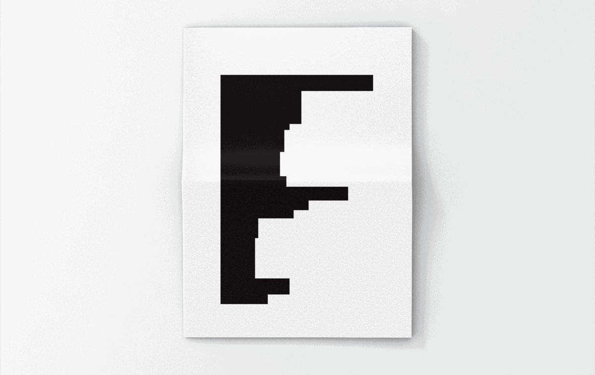
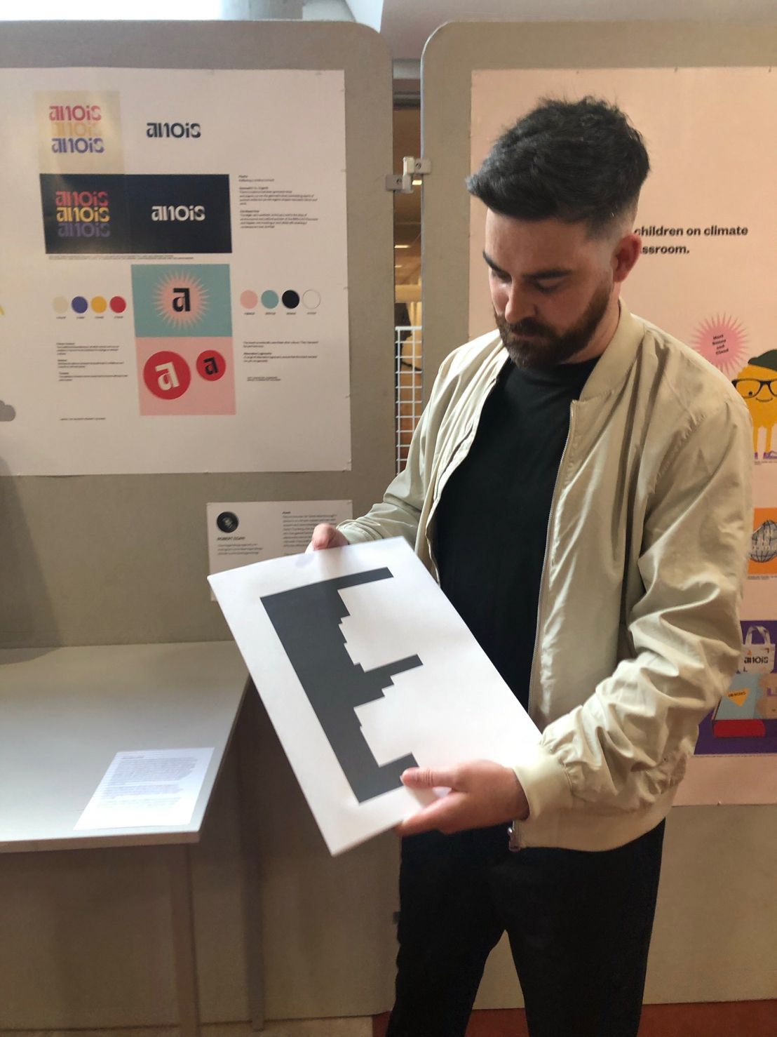
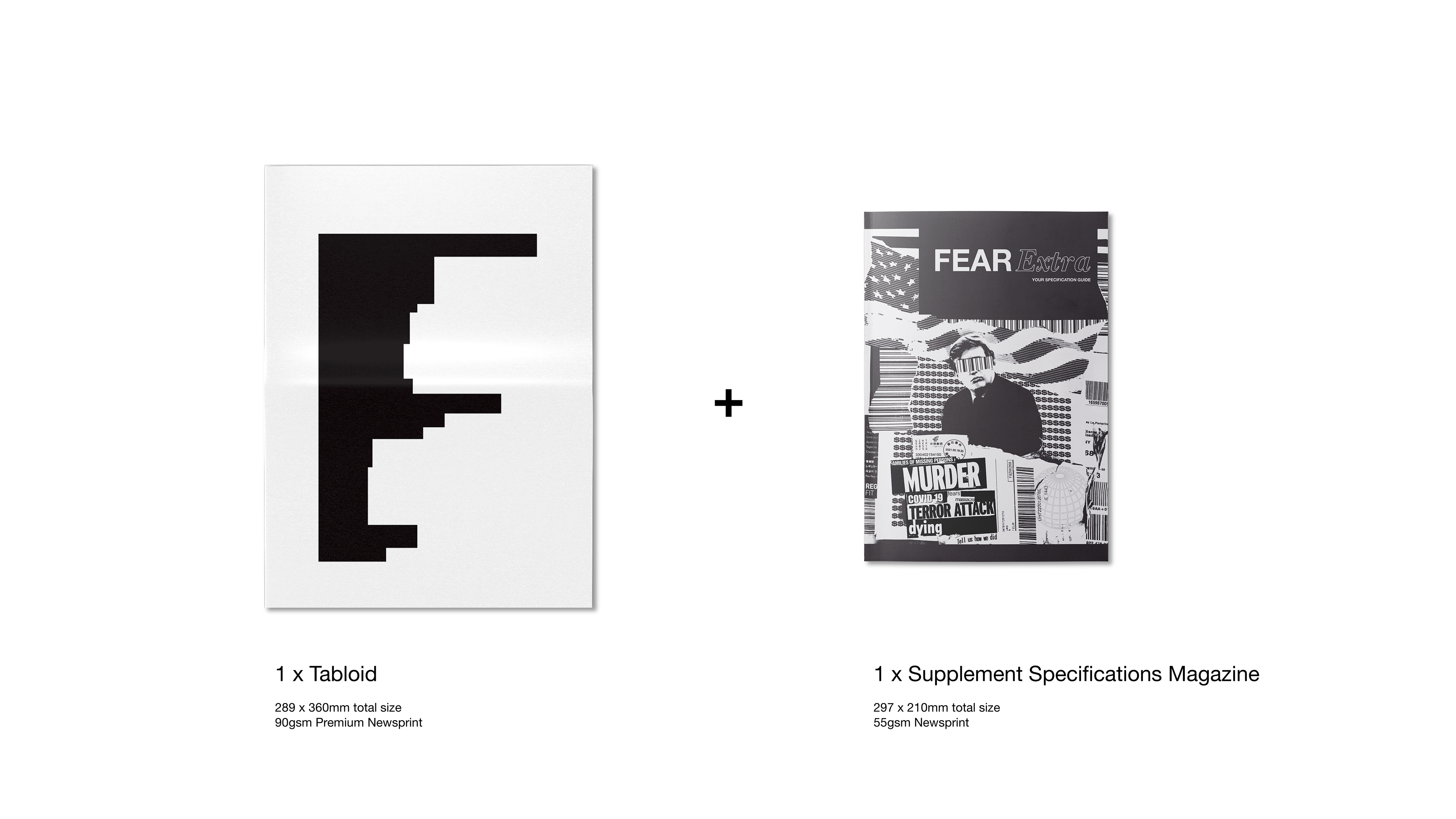

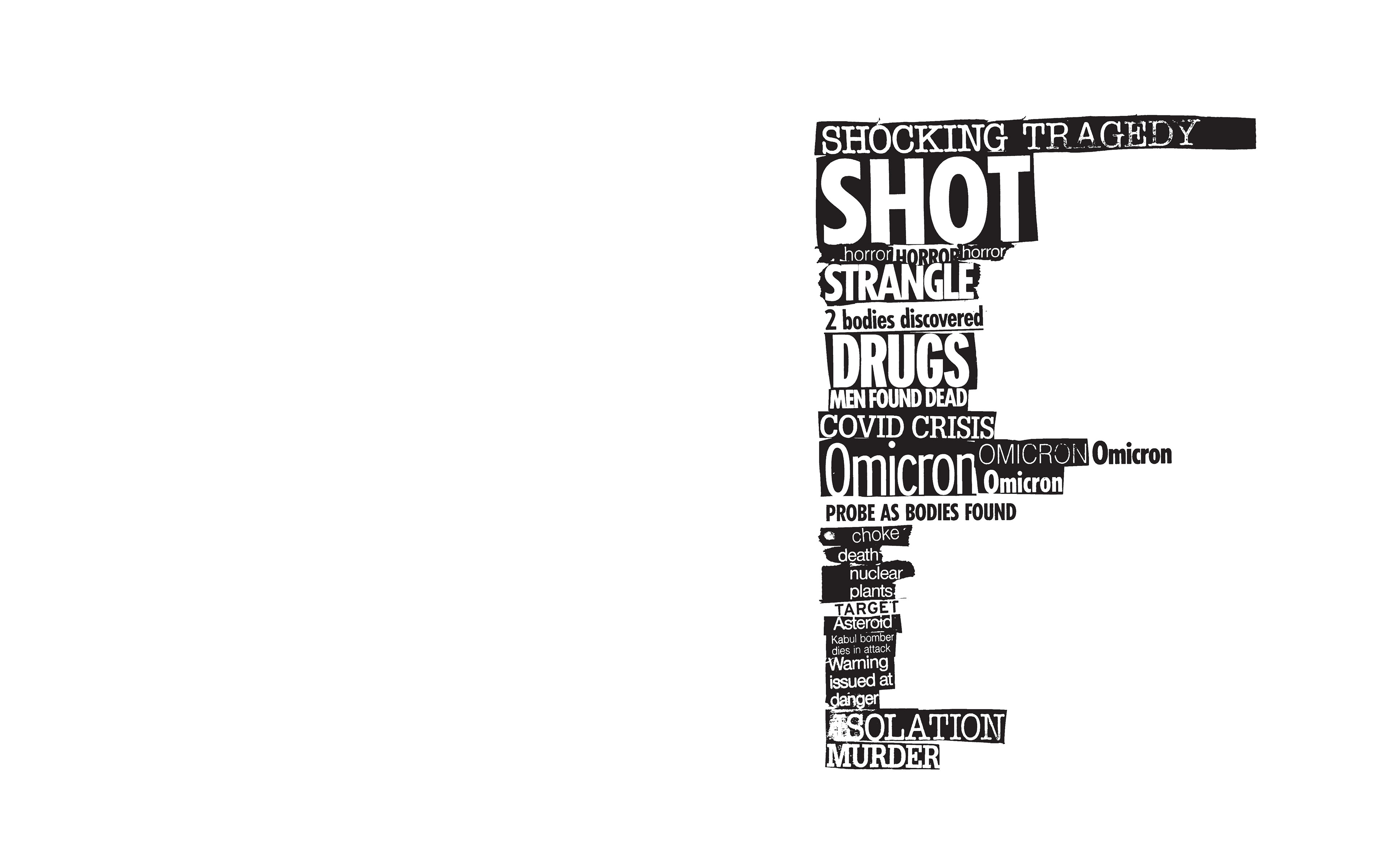

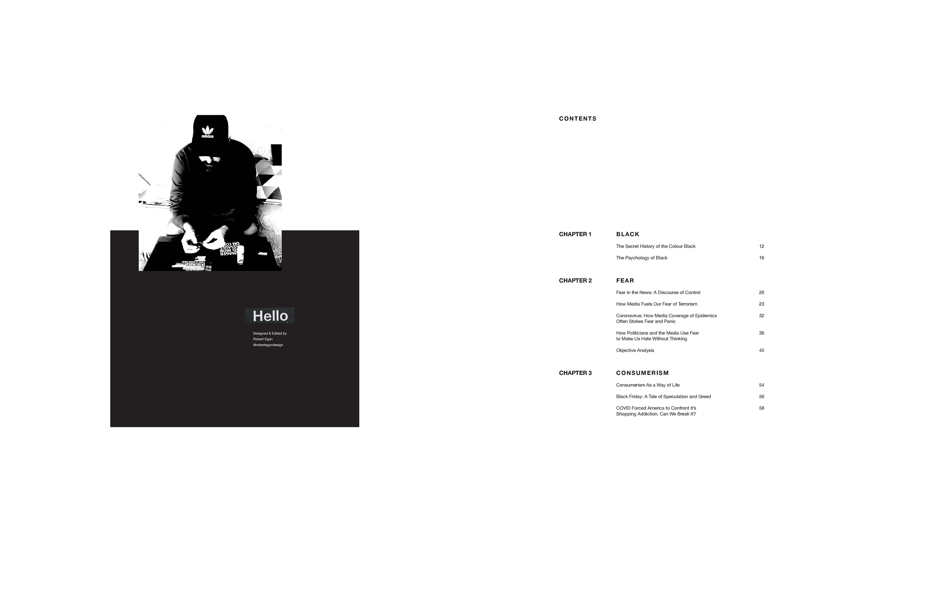
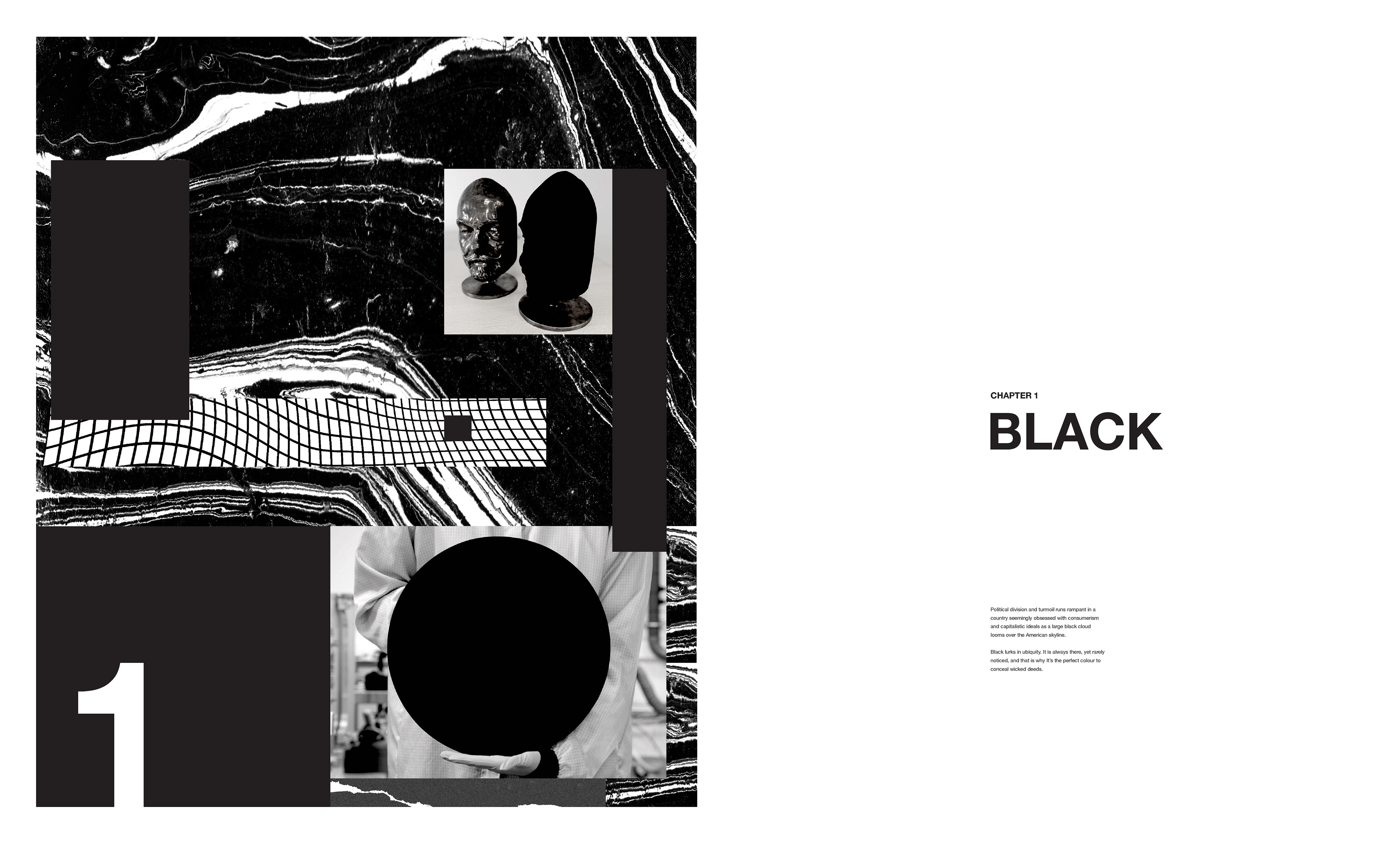

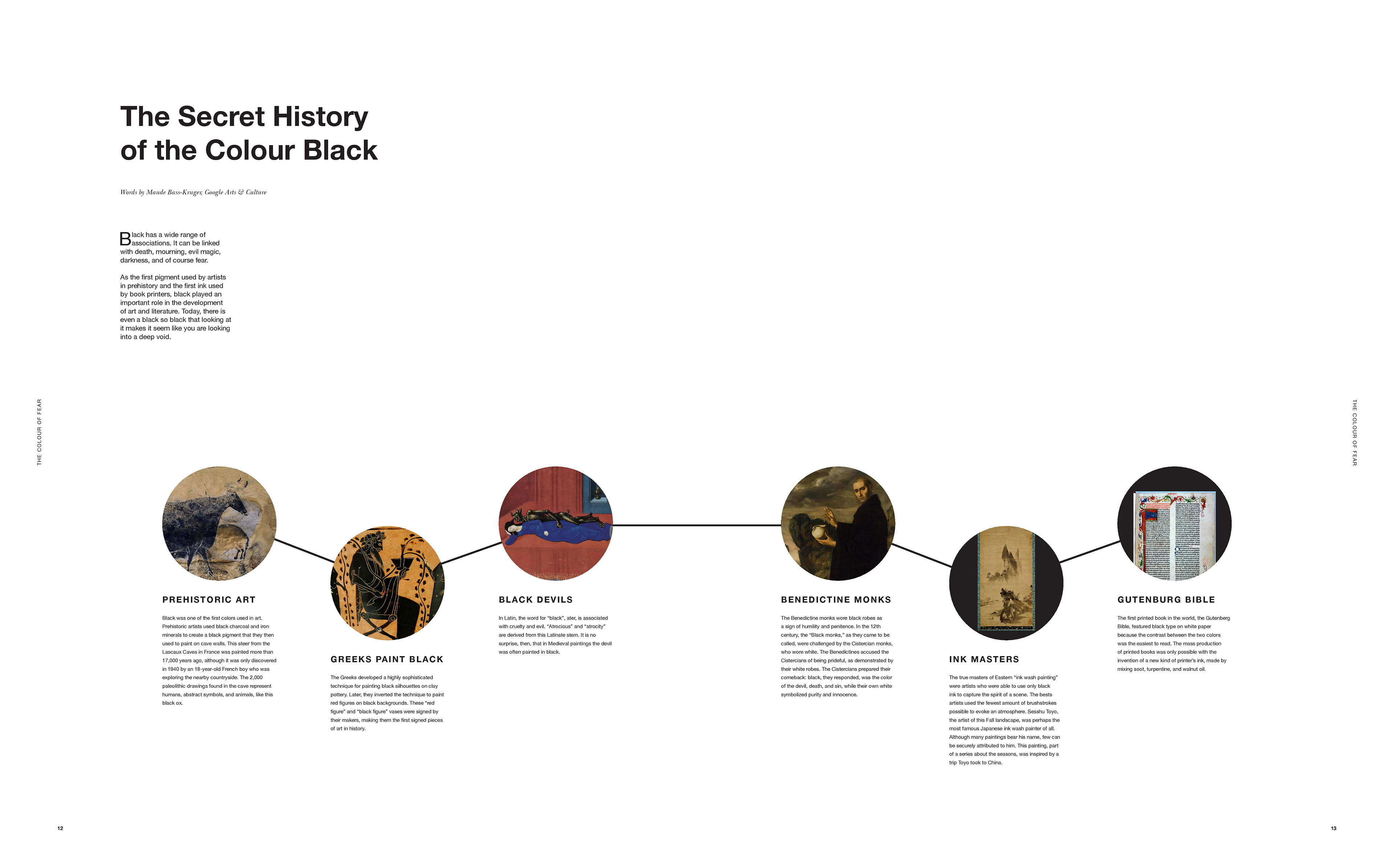
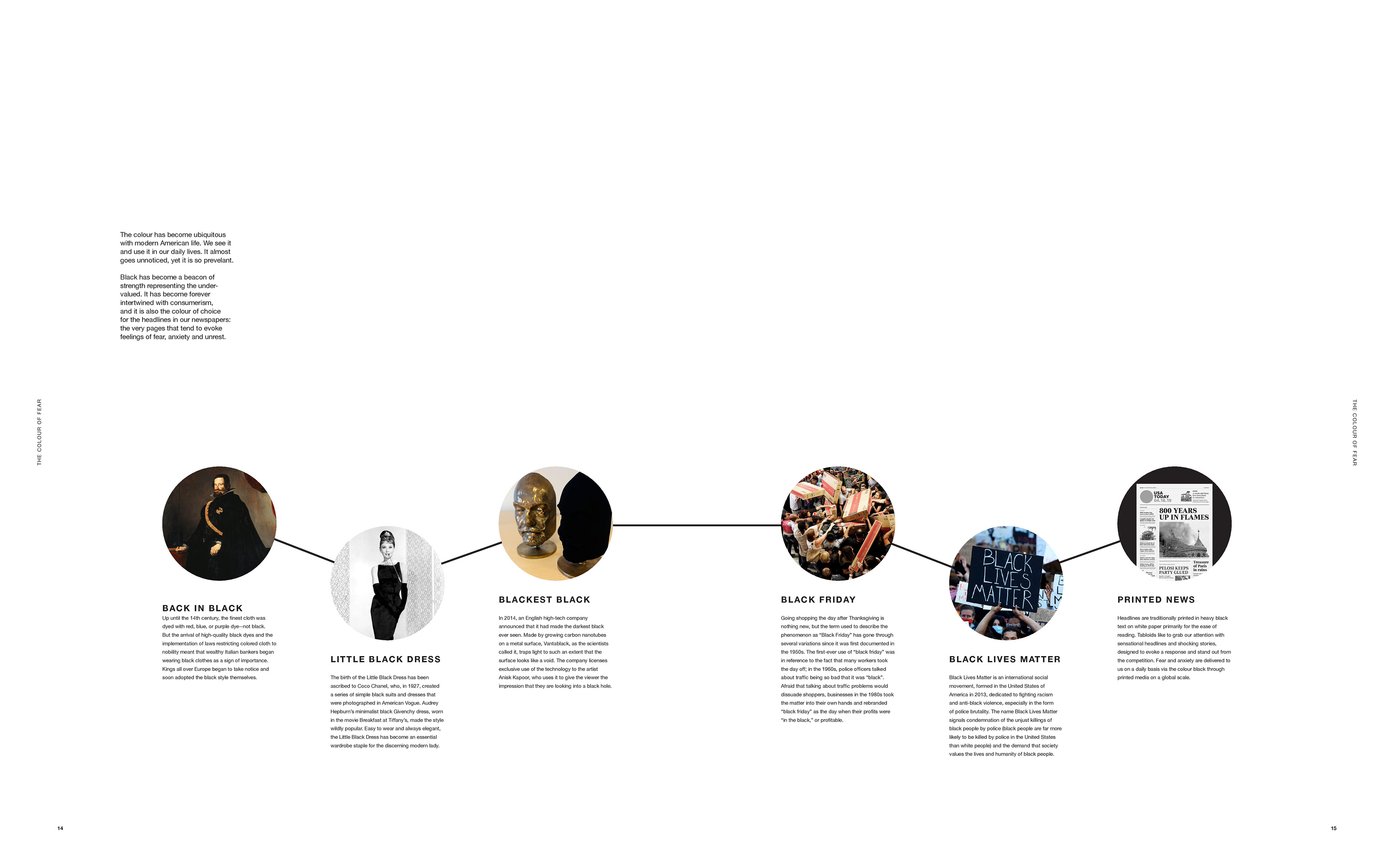
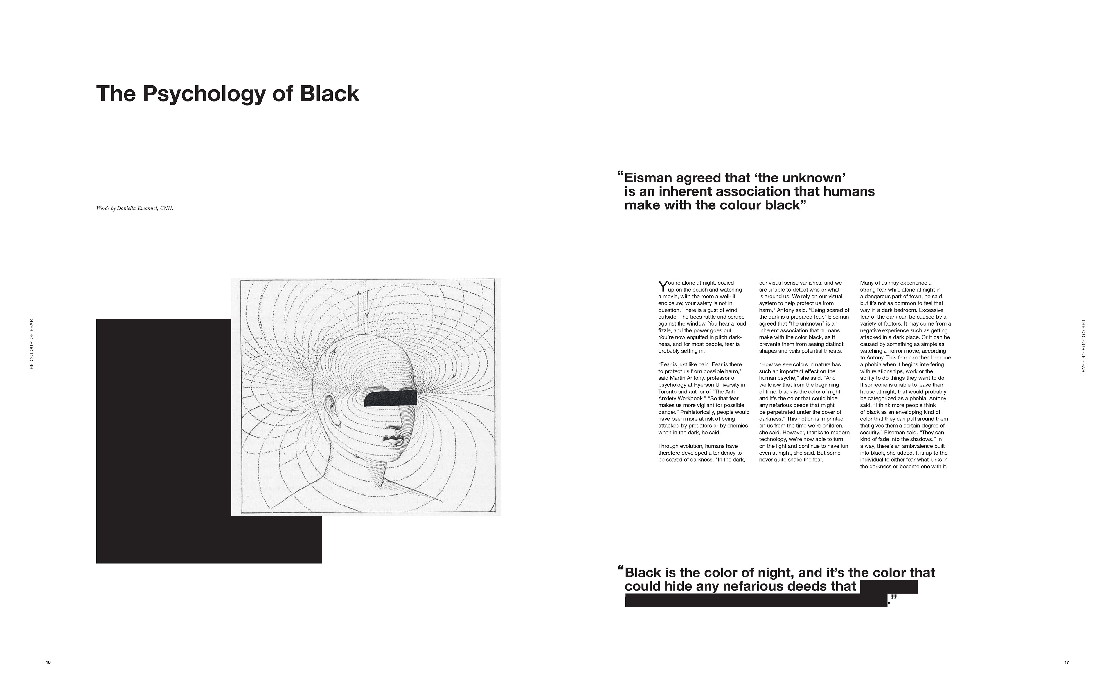
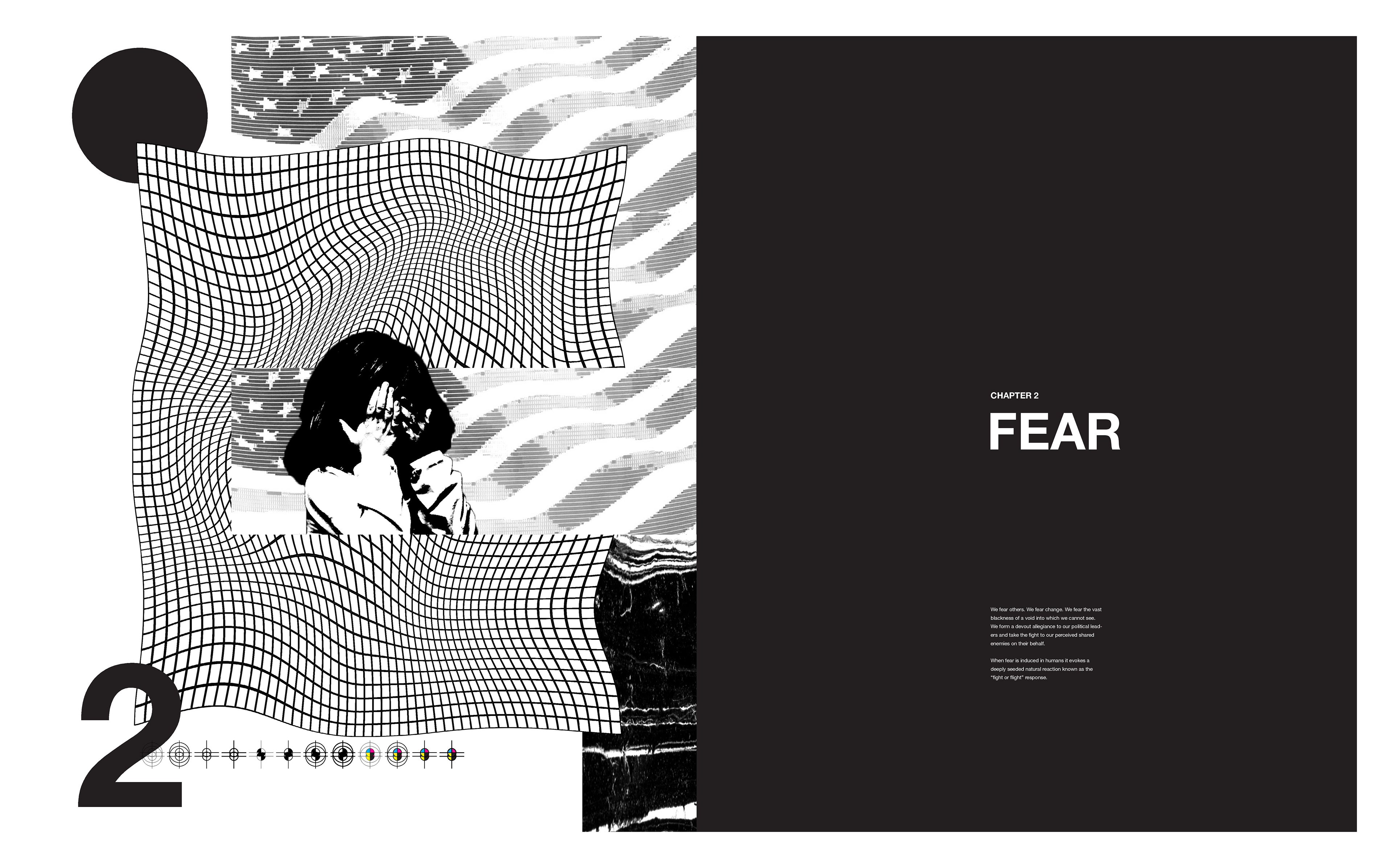
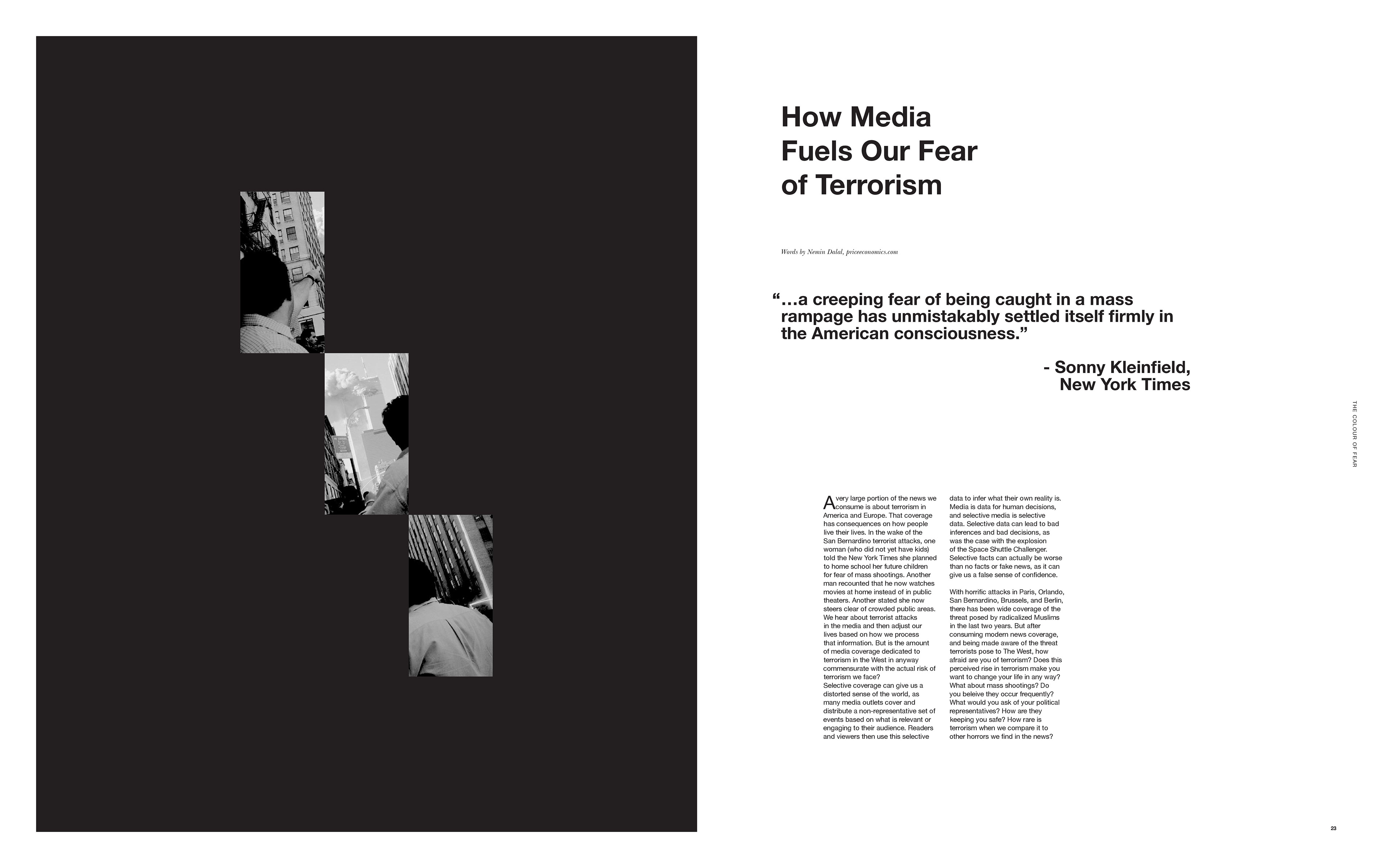
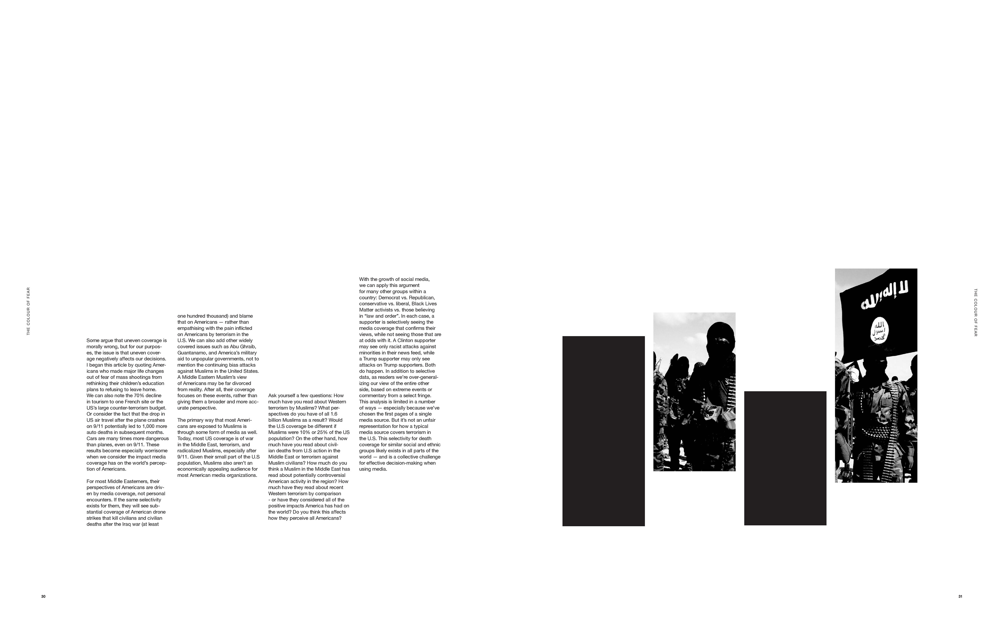
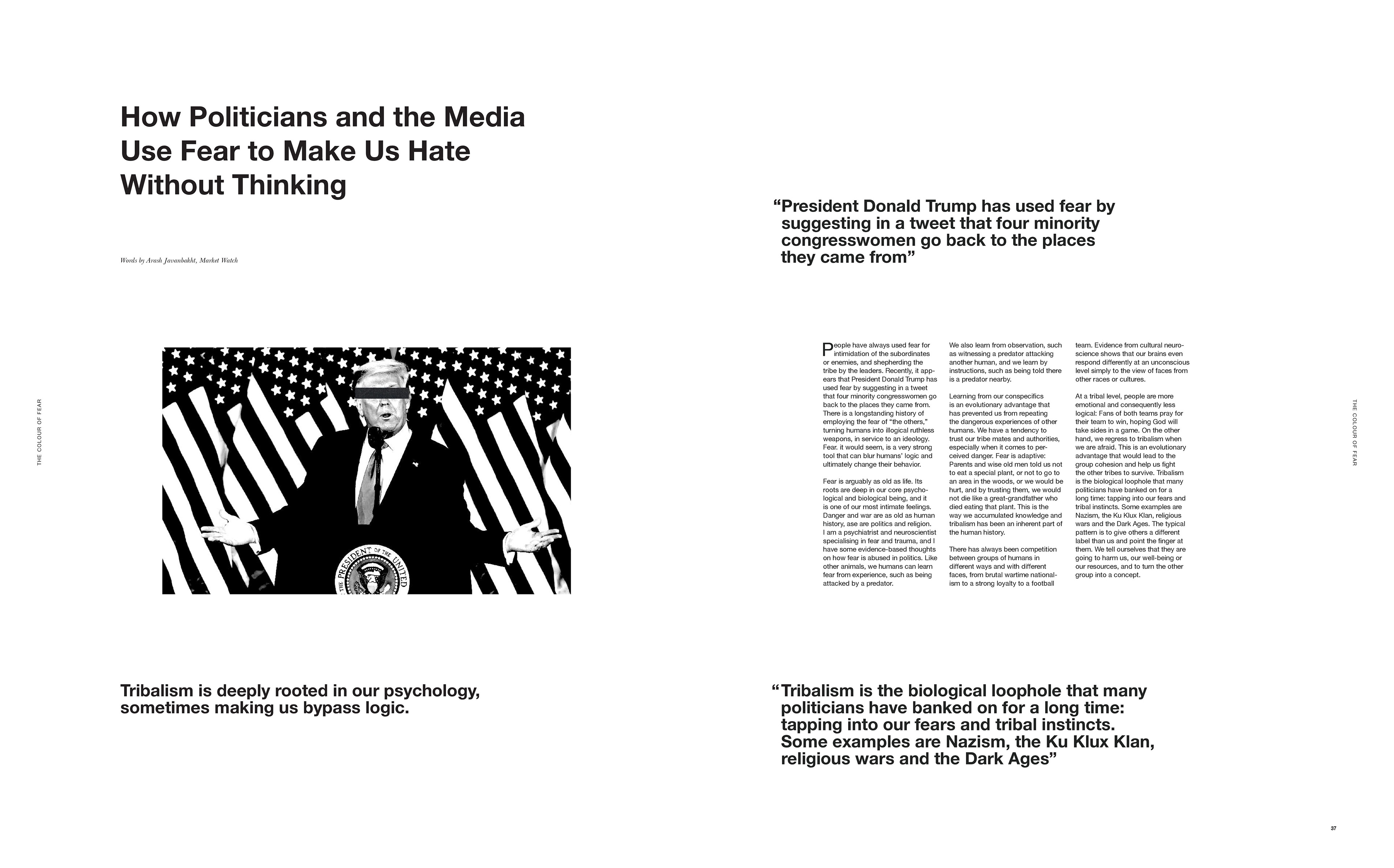
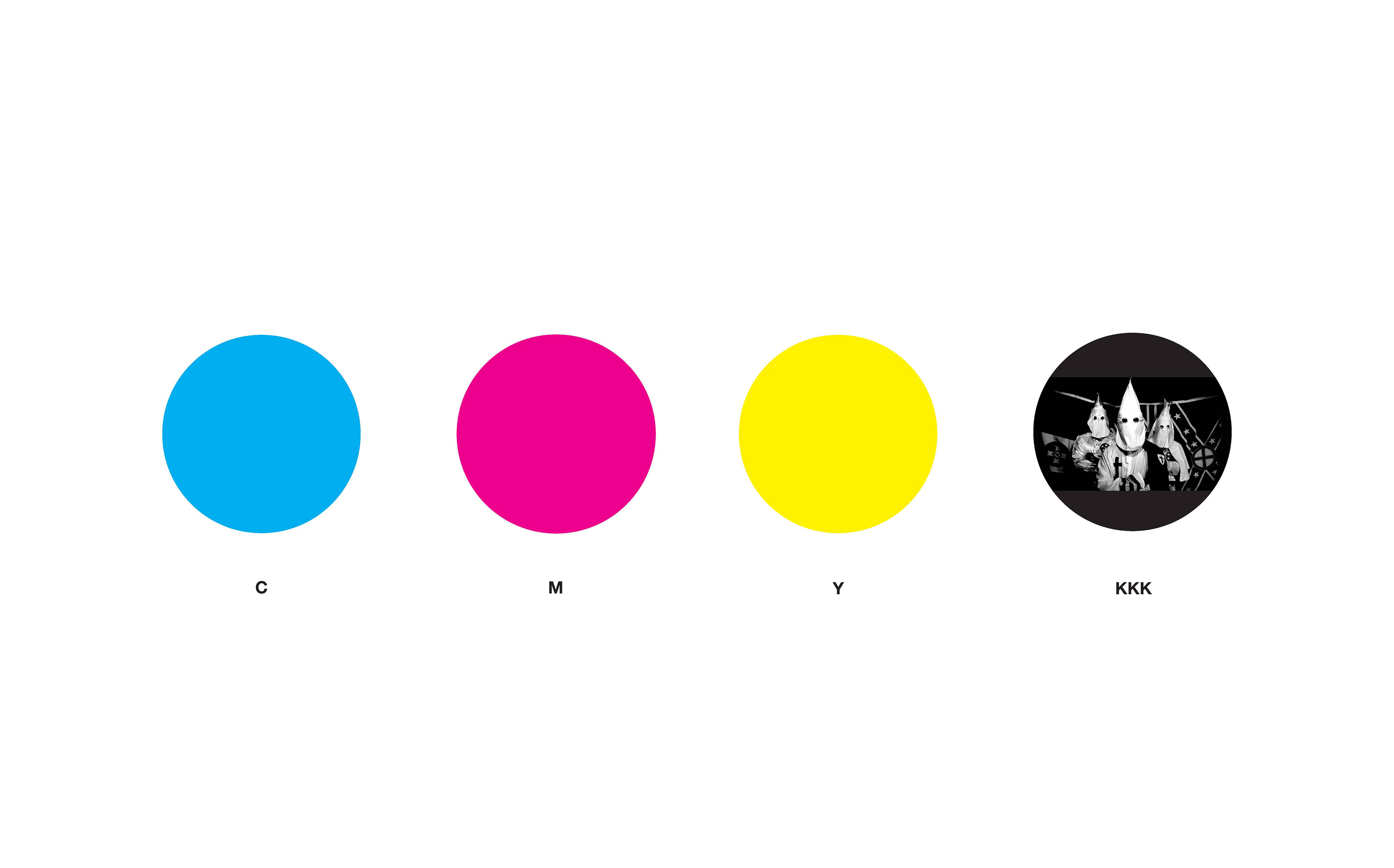

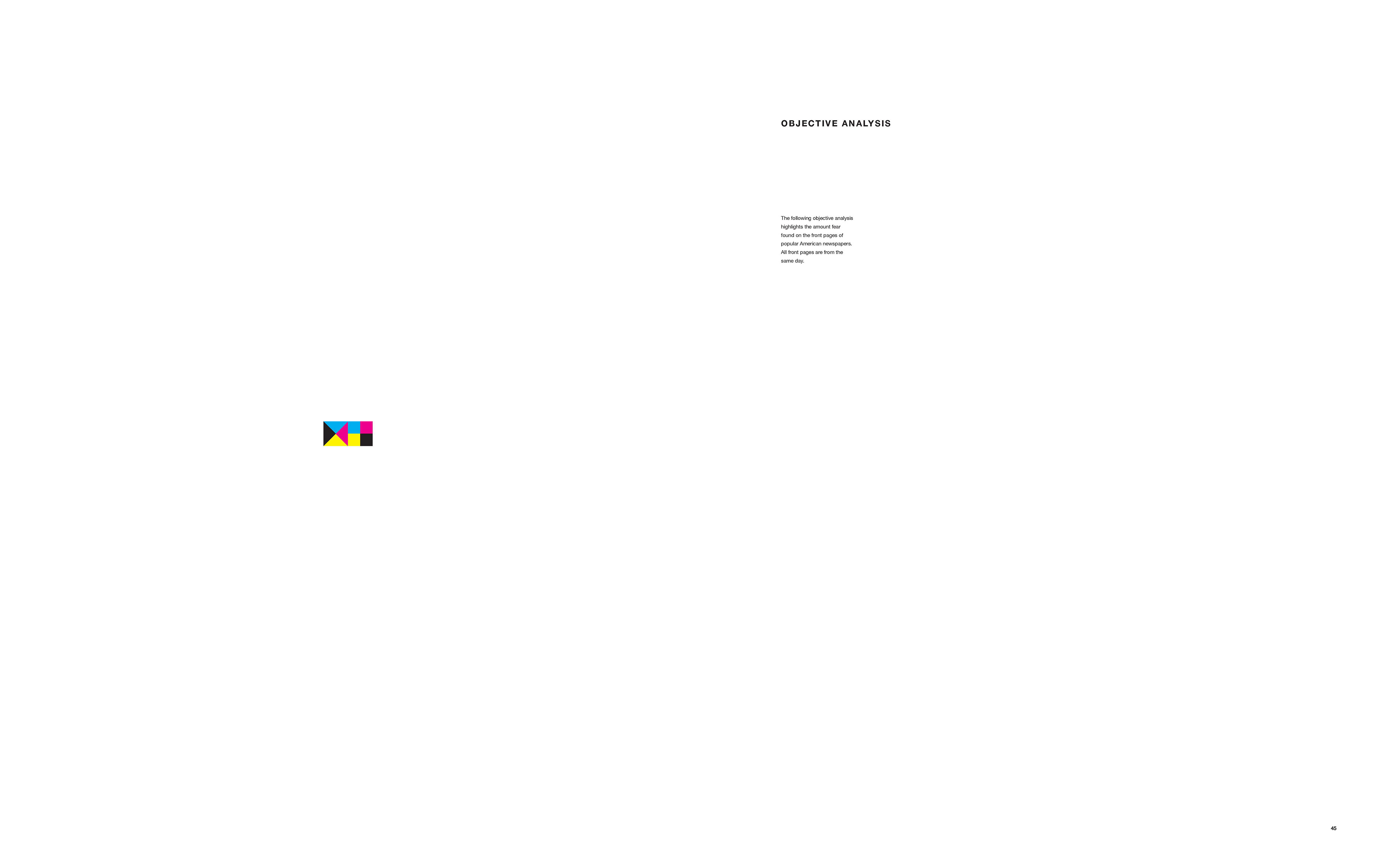
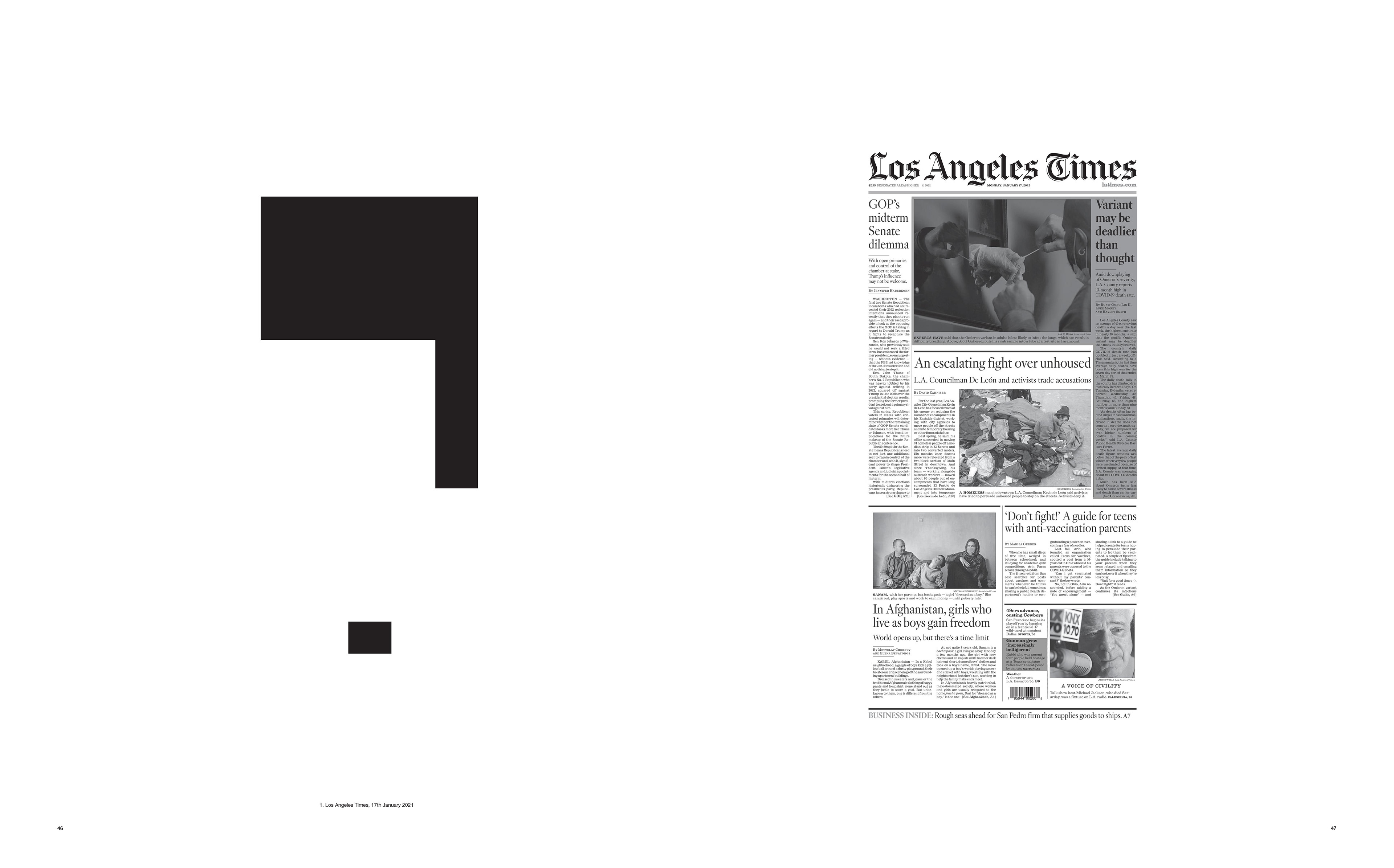
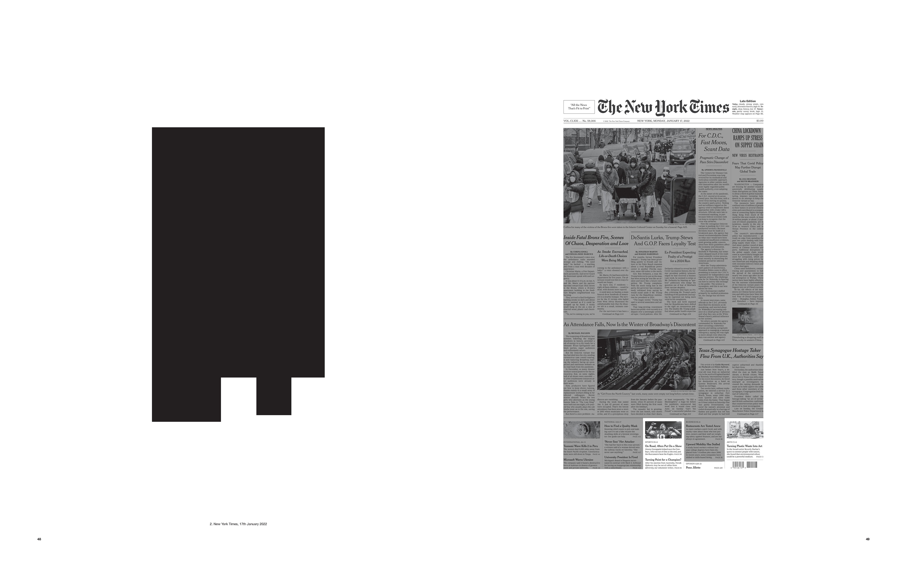
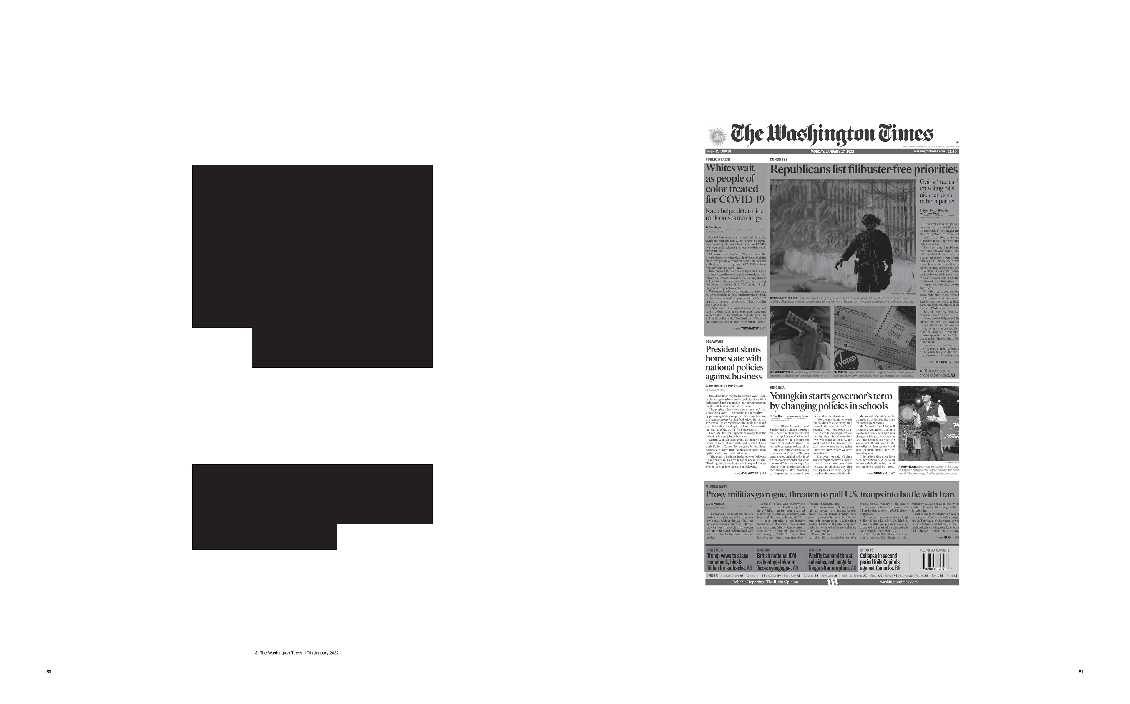
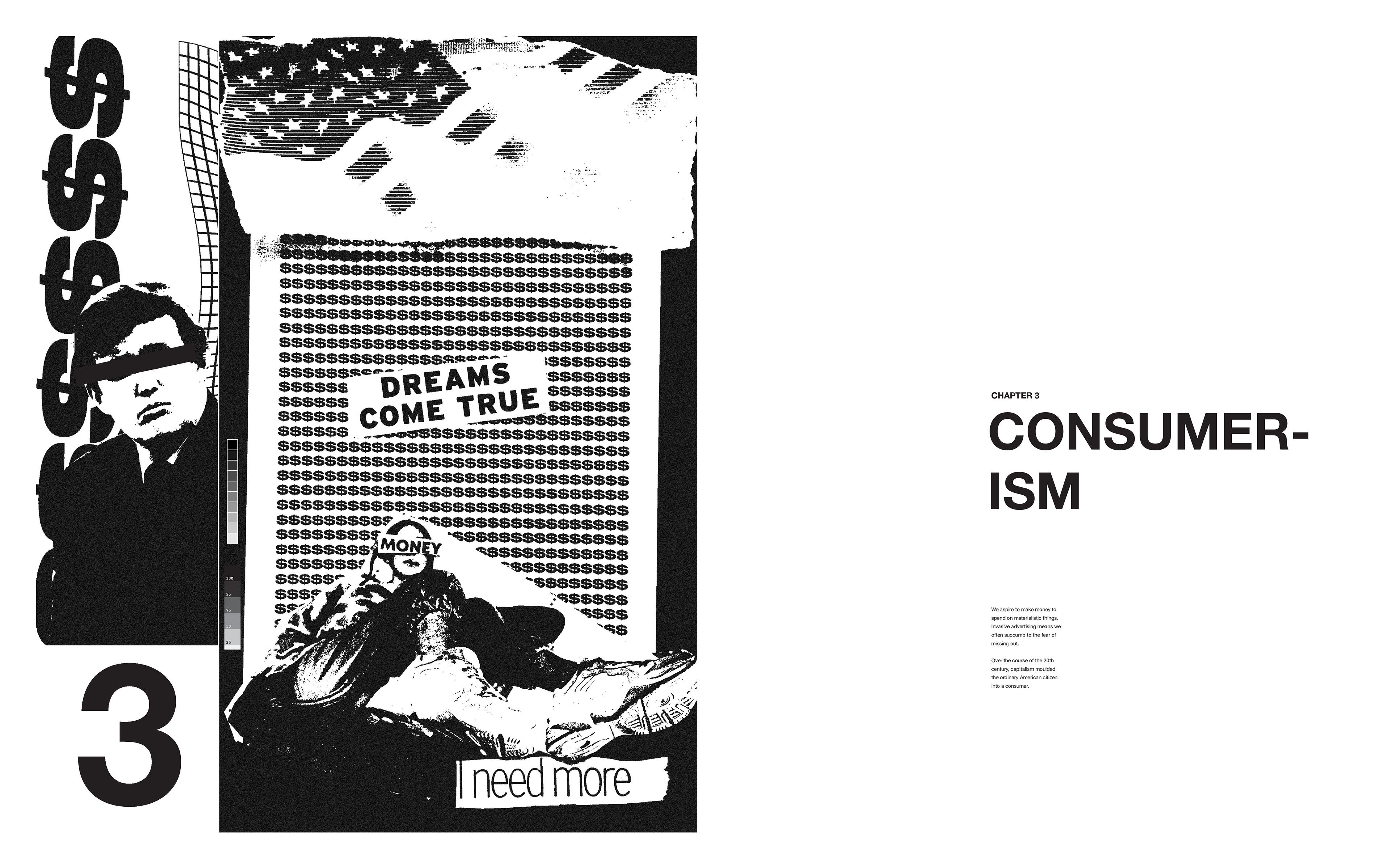
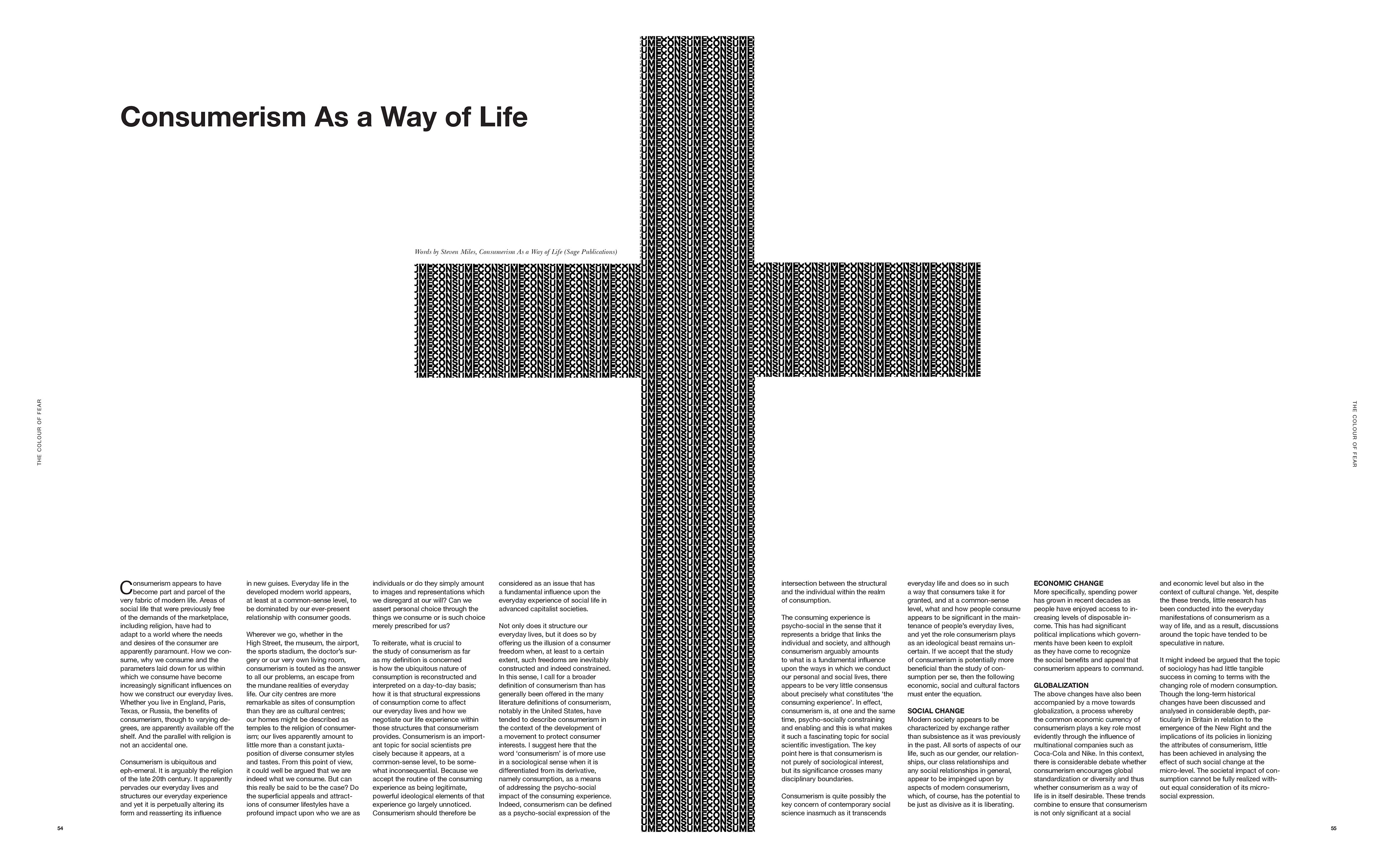
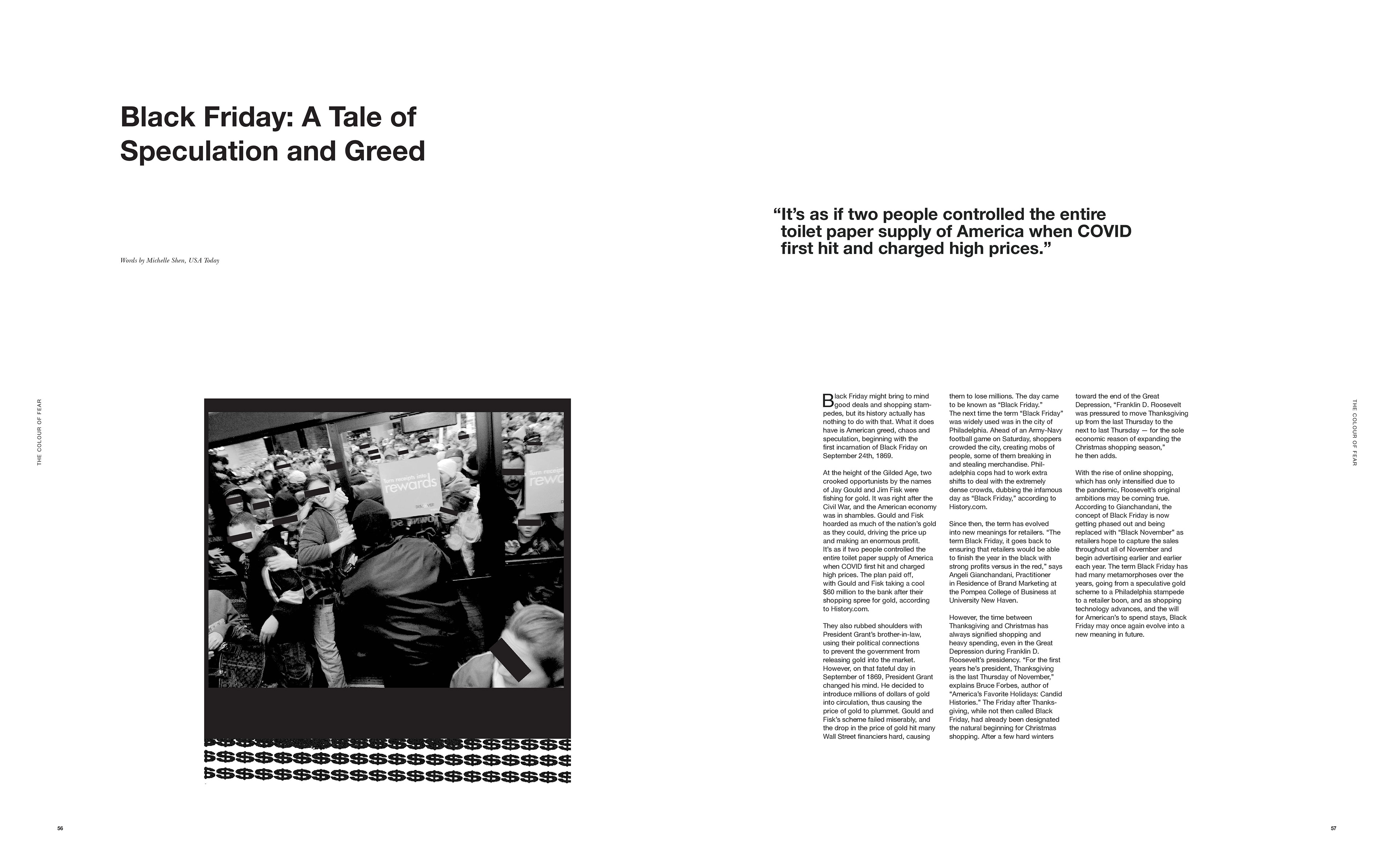
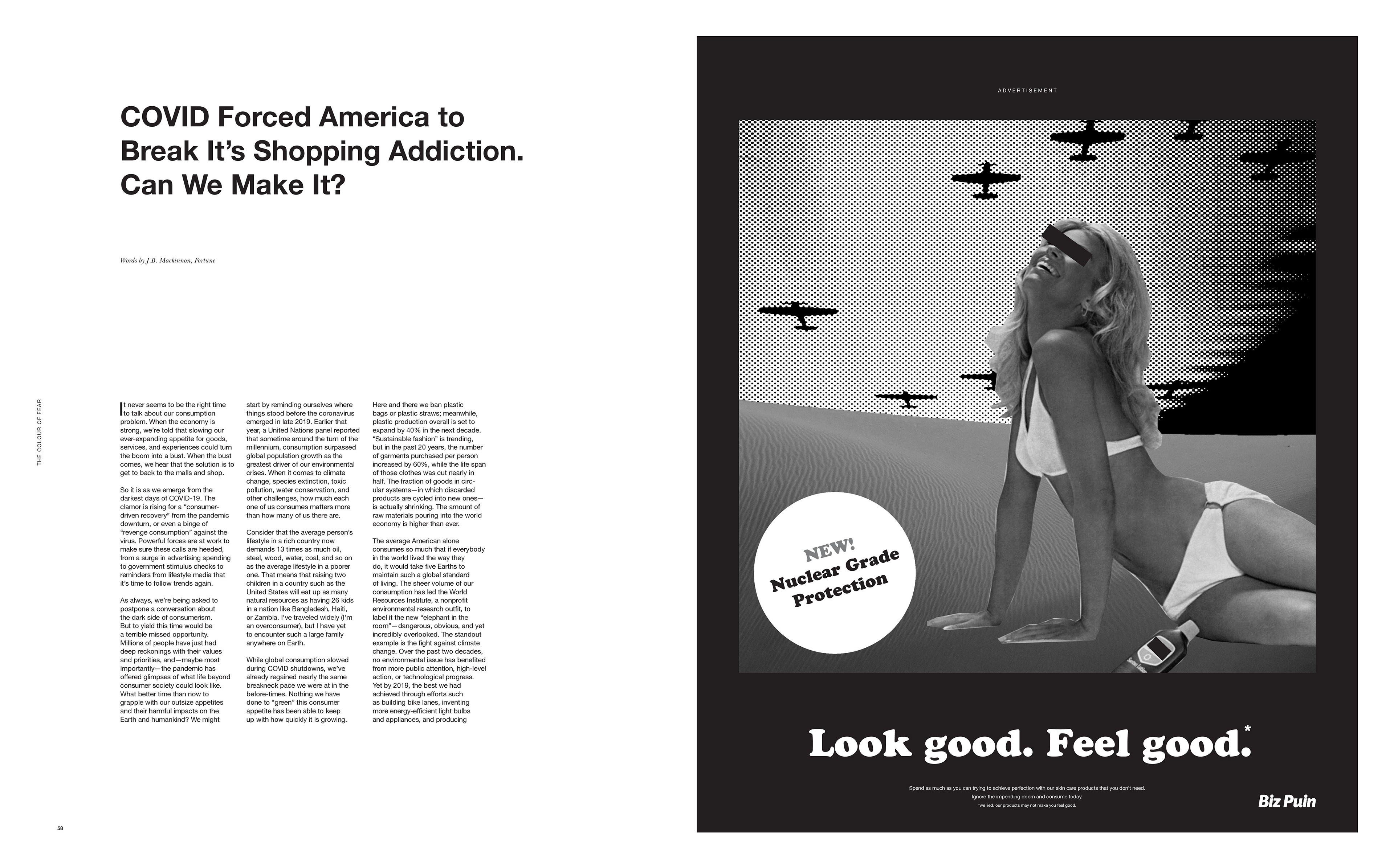
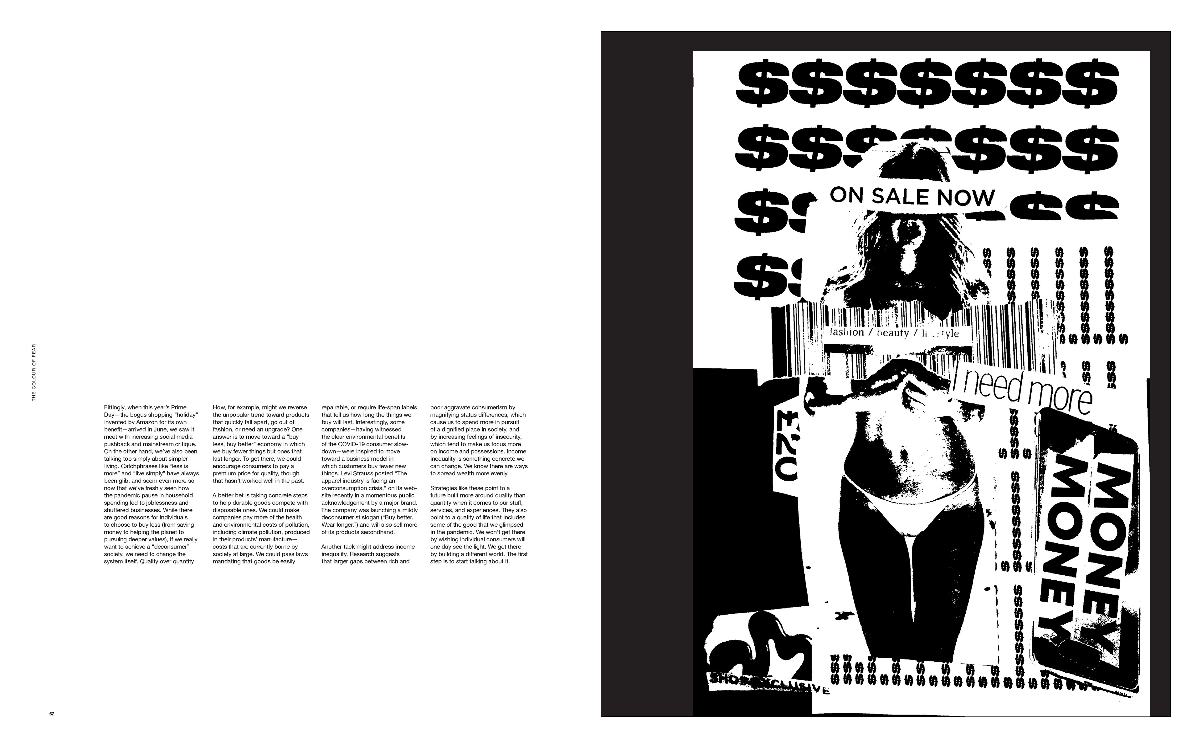
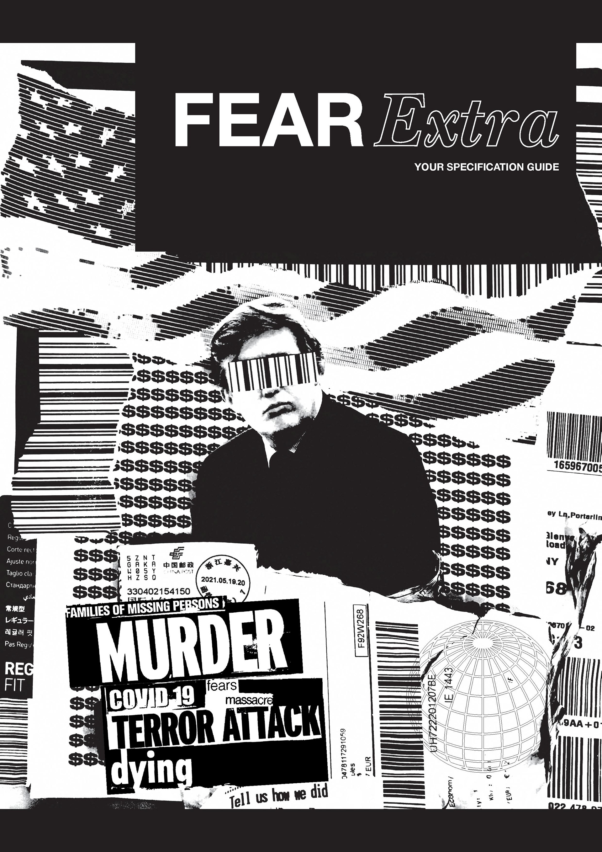
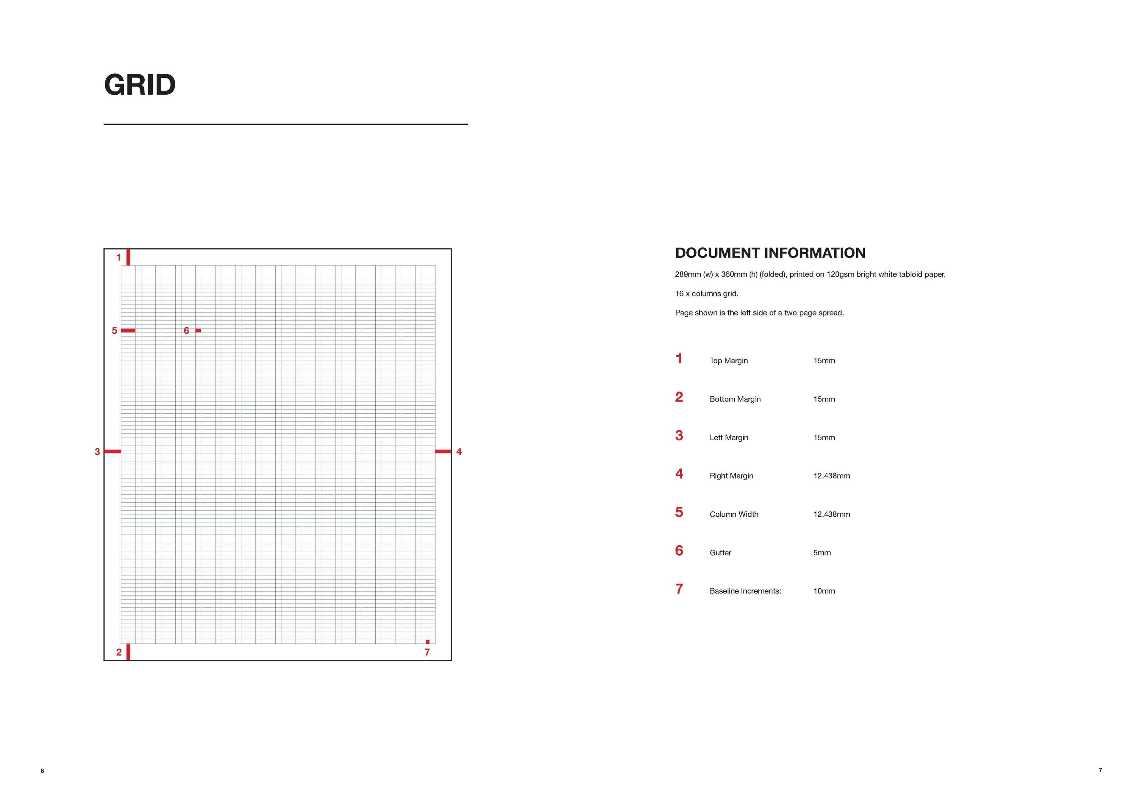
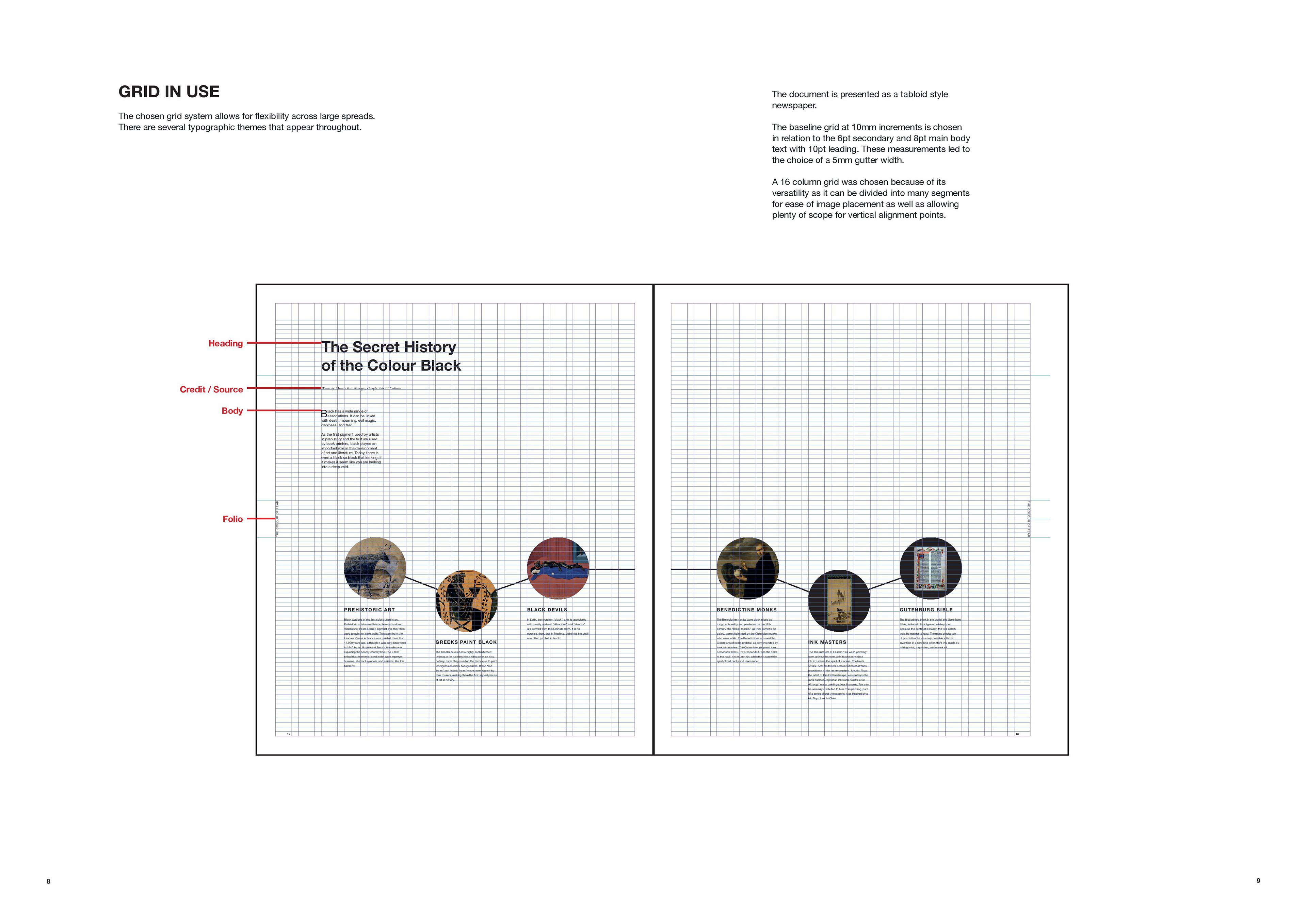
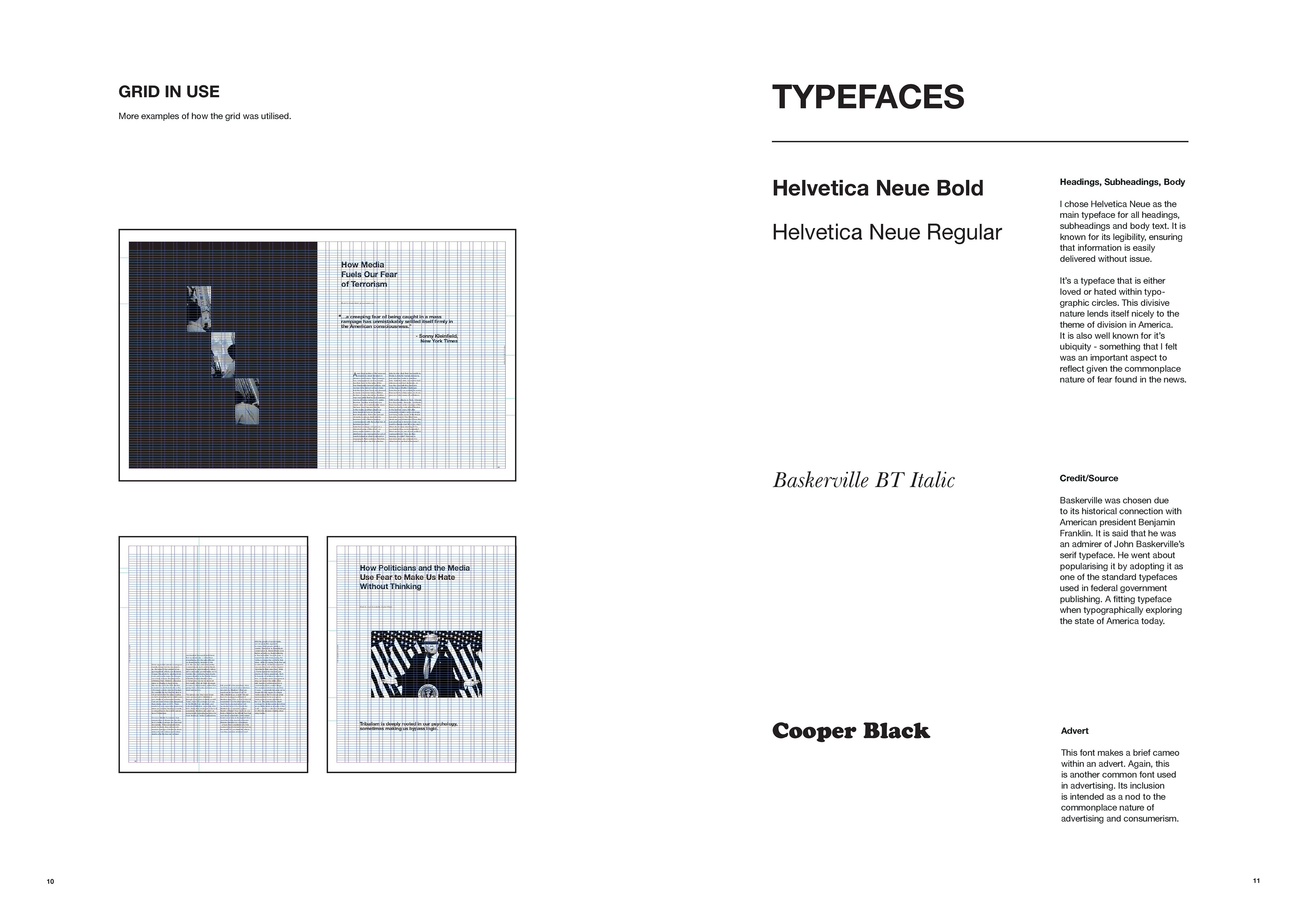
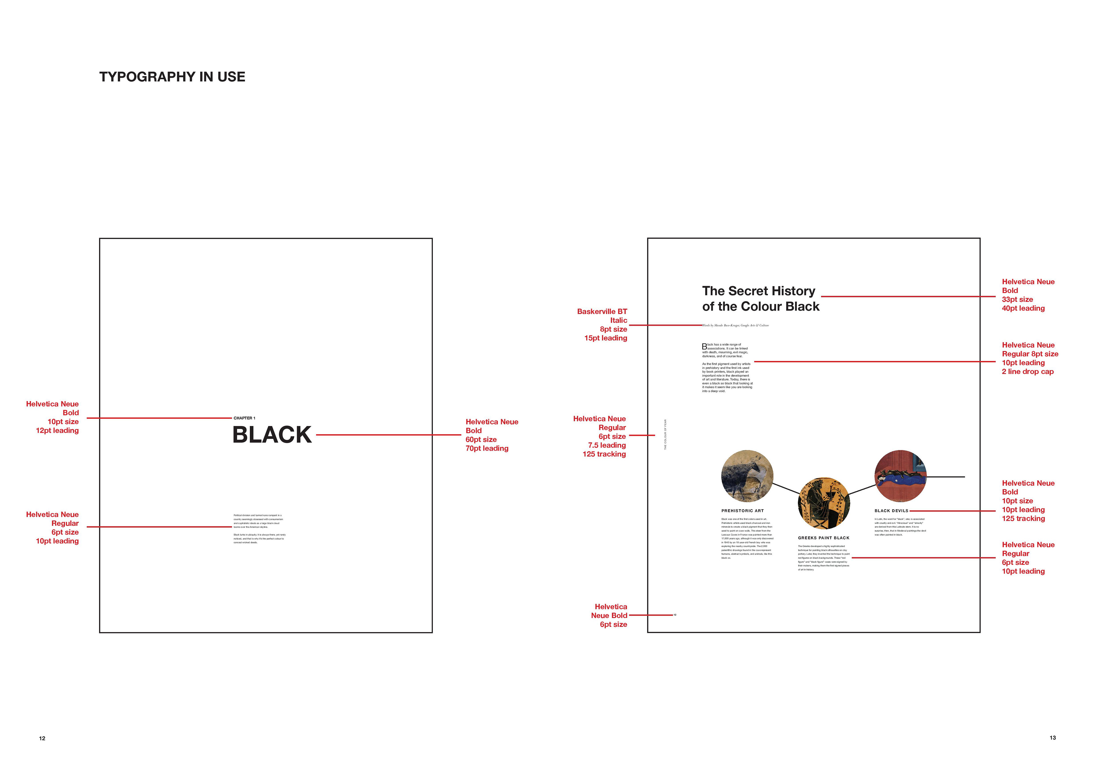
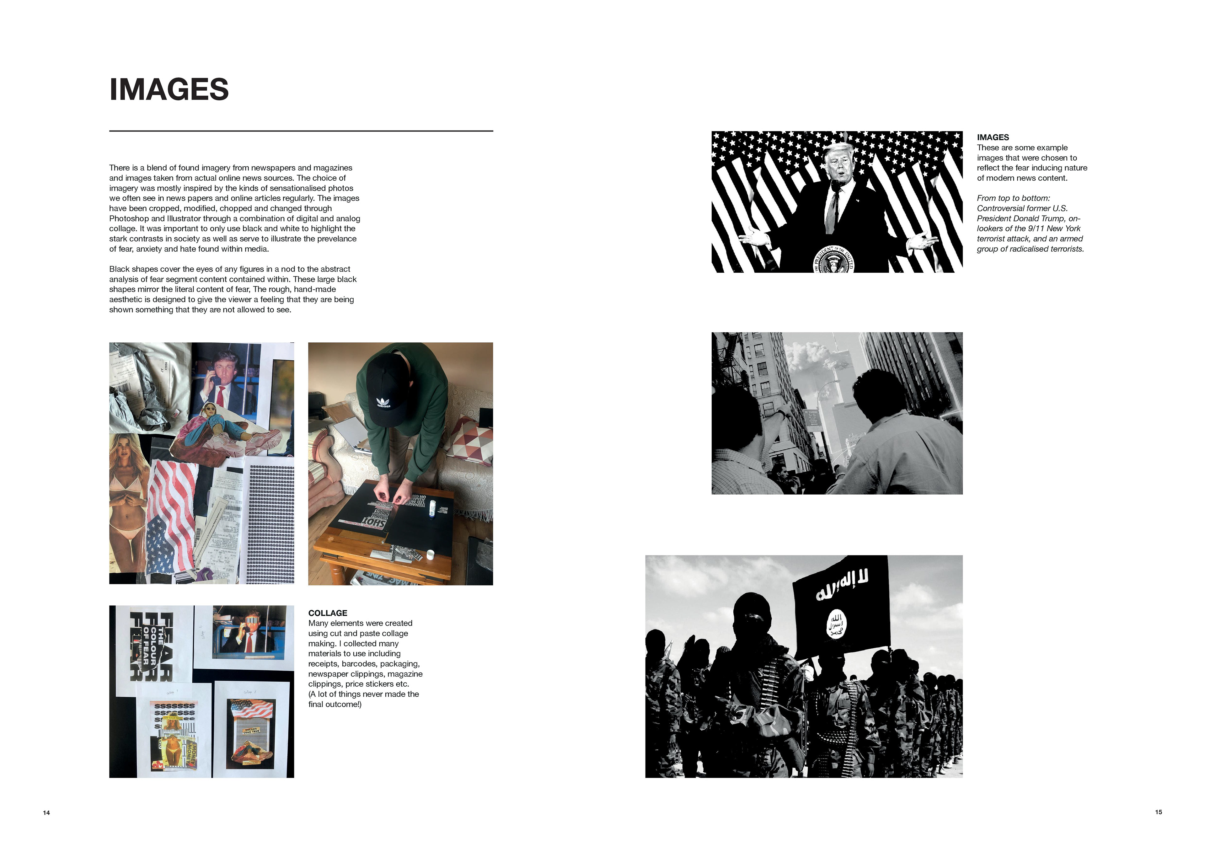
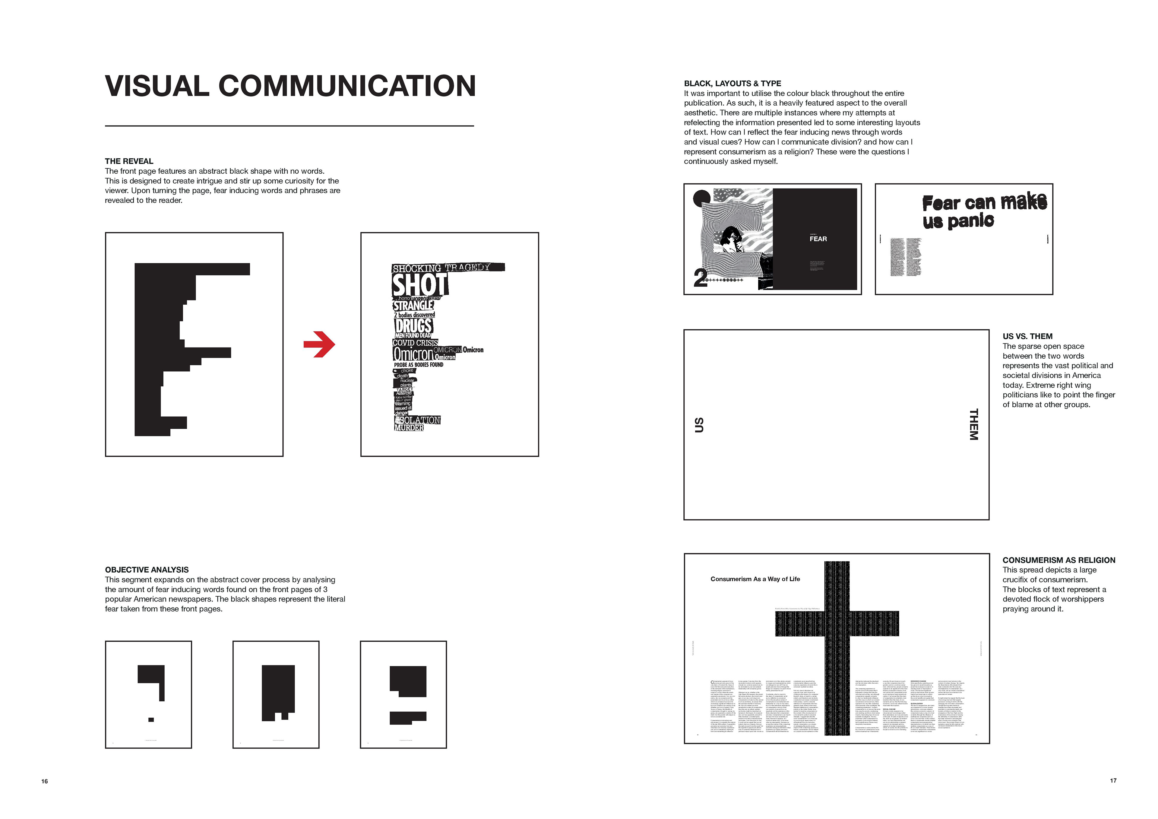

International Society of Typographic Designers (ISTD) Assessment. Merit Grade. I chose to explore and interpret ‘A Colourful Story’ from the set of ISTD briefs. ‘The Colour of Fear’ is a critical analysis of how the colour of black is intertwined with modern America. The project aims to explore how media portrays an often negative outlook – stoking fear and anxiety in the reader. Fear is something that we can feel through the news, through political narratives or through the pressures of capitalist society – particularly in such a divided nation like America. The main themes discussed revolve around social issues, political unrest, racial and economic division and how media propagates a sense of fear in a culture many see as the focal point of the western world. The front page depicts an abstract black shape designed to intrigue the viewer. When the page is turned, the black shape reveals some terrifying clippings taken from newspaper headlines – thus uncovering, or revealing the extent of fear within modern news media. The format of this publication is a tabloid style newspaper (289 x 360mm) with 15mm margins, CMYK Colours, and on 55gsm newsprint stock. The main colour used throughout is black, with a heavy emphasis on large block-like shapes – in reference to the main theme of fear and how I am trying to show this to the reader. Type adheres to a flexible 16 column grid per page that is often used expressively; again sometimes this is a reference to the abstract black shapes of fear. Helvetica Neue is the chosen typeface as its ubiquity reflects the commonplace nature of news and media. I believe that this reflects nicely with the chosen colour of black too; an often overlooked colour that shows up time and time again in daily words and phrases. Each spread begins with a drop cap for ease of legibility for the reader. Quotes and statistics appear heavily throughout to give a sense of understanding and to keep the reader engaged. There is a central line running across the spreads containing the title on the edge of each side of the page. This invisible central guide line was used many times as a divider or a guide for object placement. The 3 chapters contained within are Black, Fear and Consumerism, with each chapter featuring a news article or excerpt from a book discussing relevant views or information regarding topics of fear in U.S.A. I believe the eclectic collection of stories from various media outlets closely echo the real life layout and narrative from newspapers. There are large collage images used throughout to create a sense of overwhelming. Imagery used often blocks out the person eye with a black rectangle – again this is a nod to the theme, whilst also adding a sense of fear to the subject. The Objective Analysis section aims to strip back and highlight the pure feeling of fear that media presents to us. Much like the front cover’s abstract shape, this analysis of 3 American newspapers highlights the amount of fear that could be interpreted from the front pages all from the same day. The black shapes are referenced throughout, appearing in experimental blocks of text as well as within the imagery. Many images were created using a collage cut and paste technique, then scanned and manipulated through computer software. There are many references and nods to the newspaper printing industry contained within the project, with the accompanying 'supplement' magazine presenting the specifications and details for the tabloid. There are various registration marks appearing throughout as well as the intentional use of the colours CMYK.


