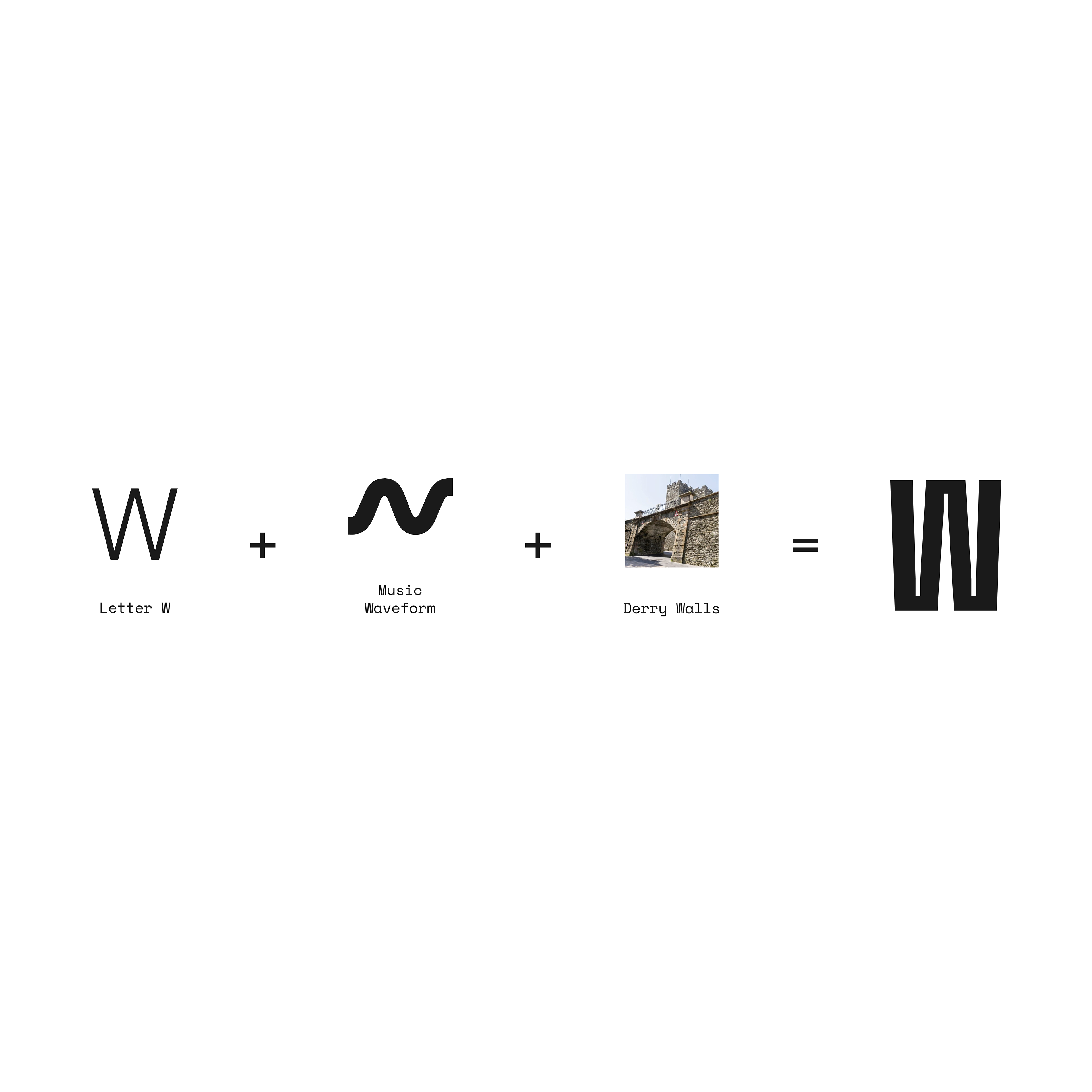

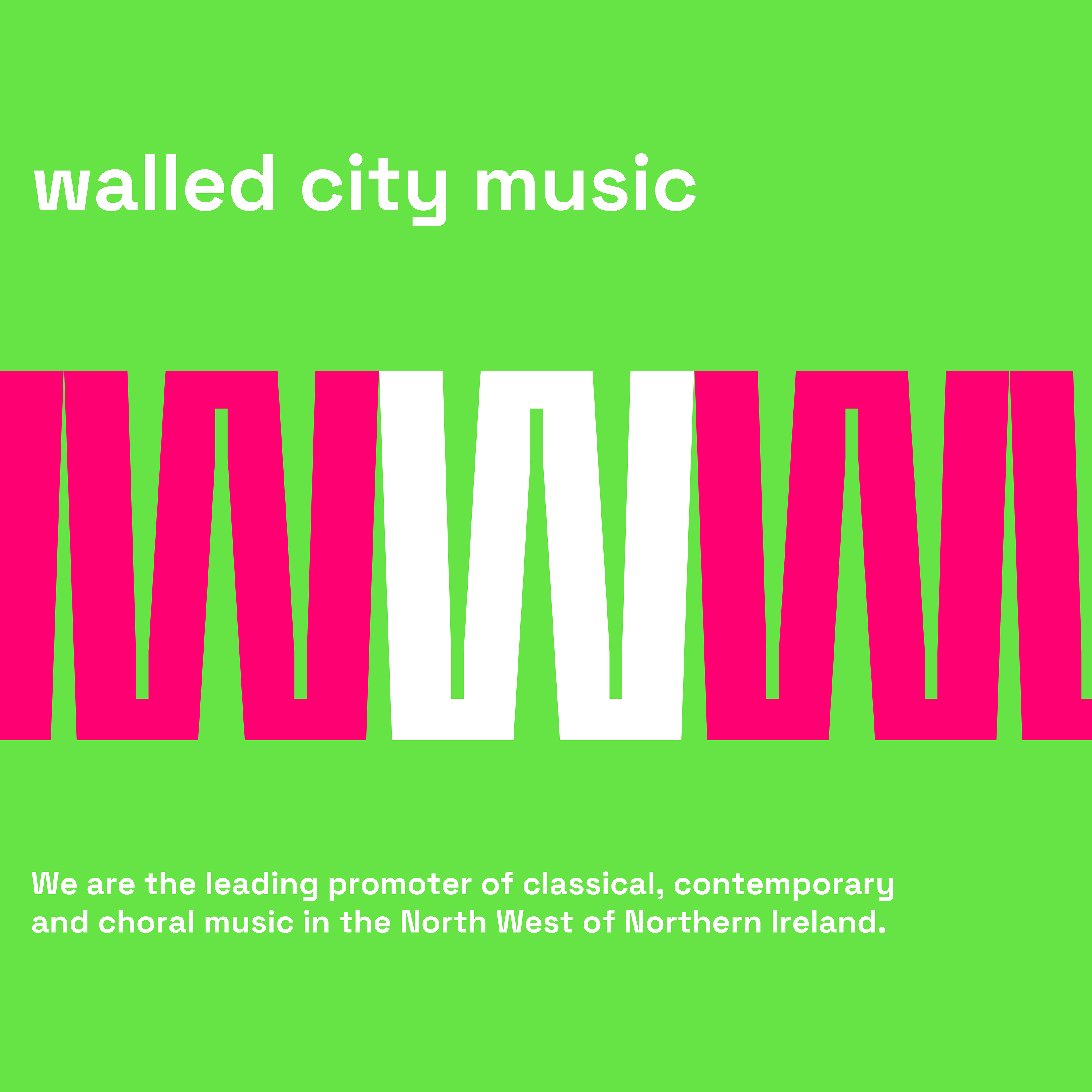
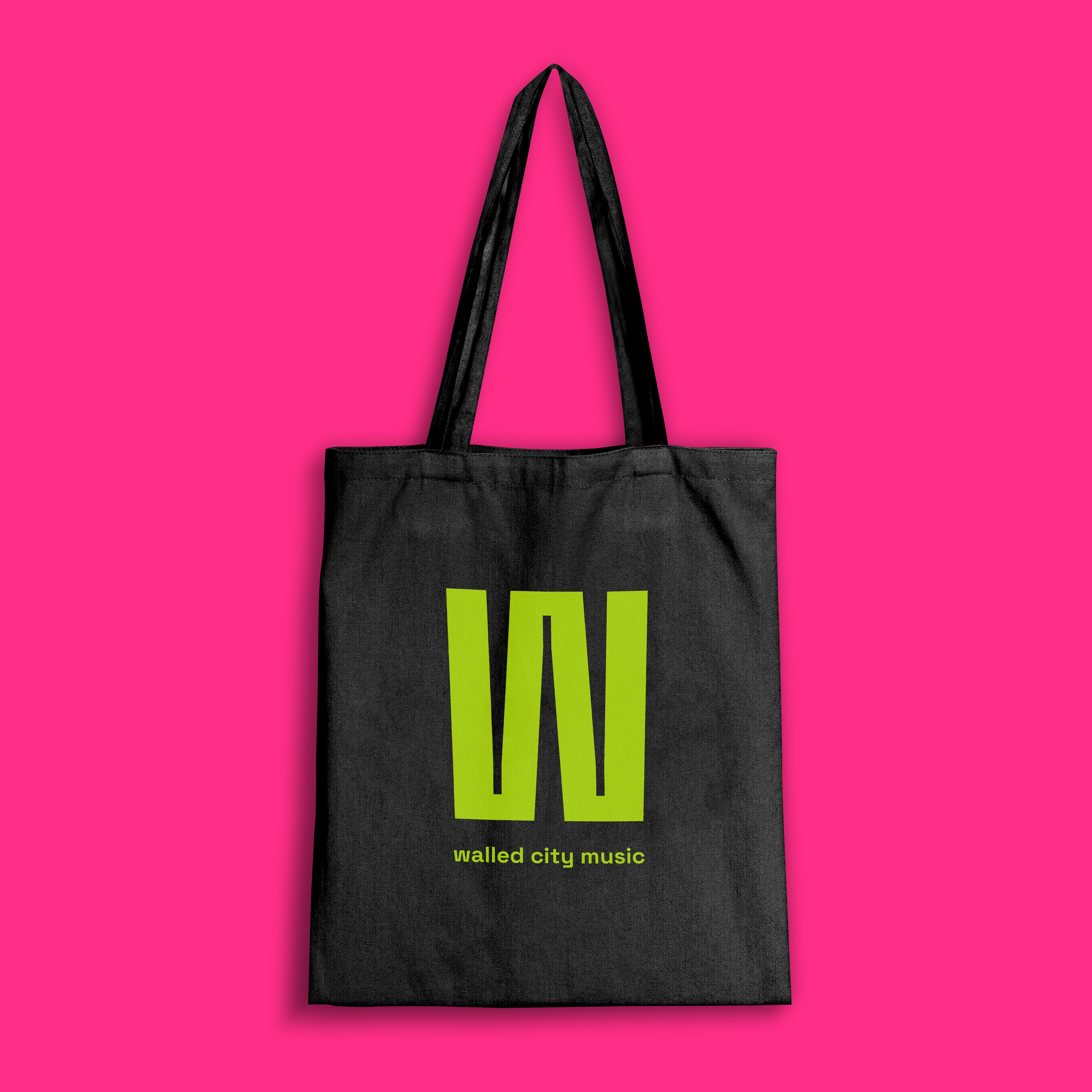

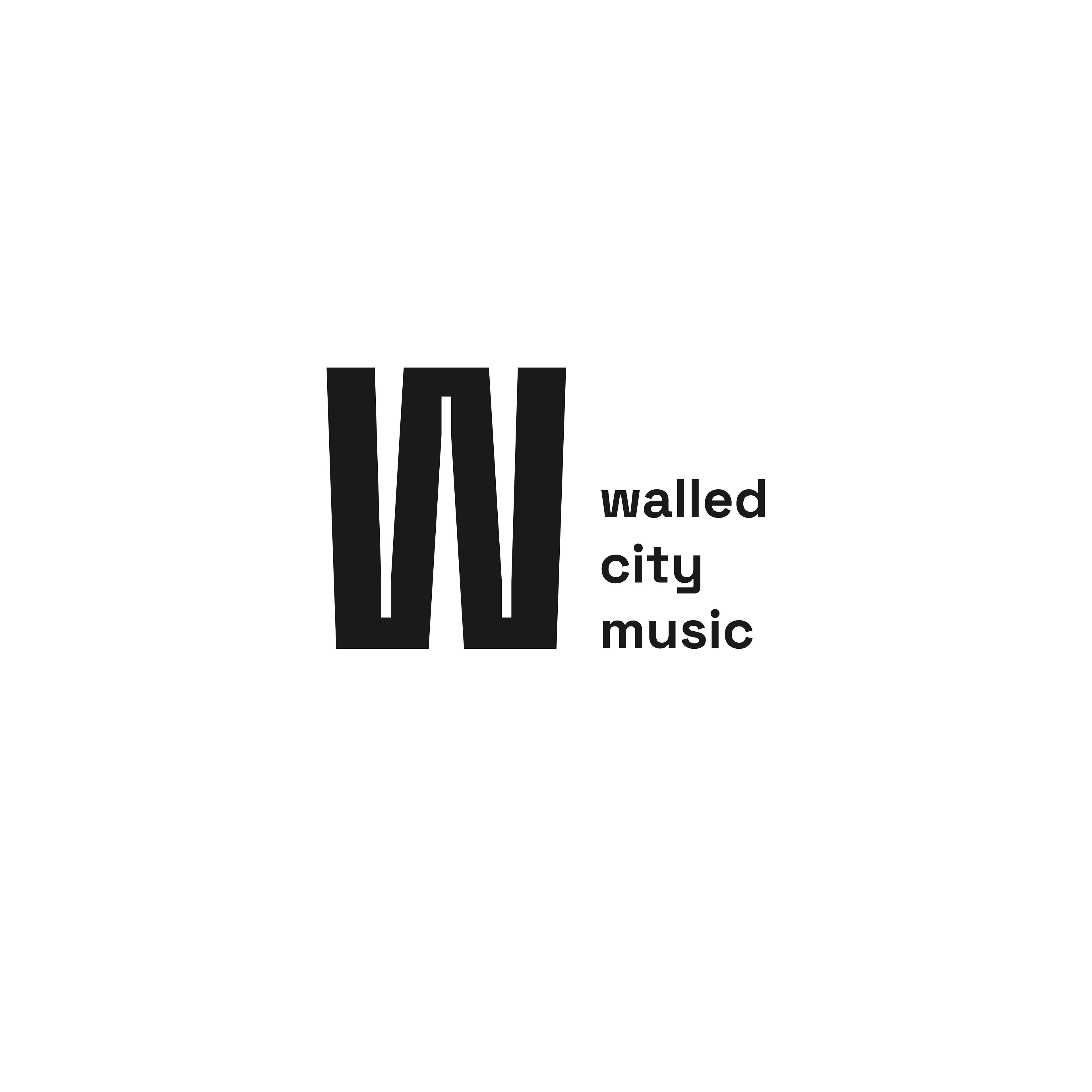
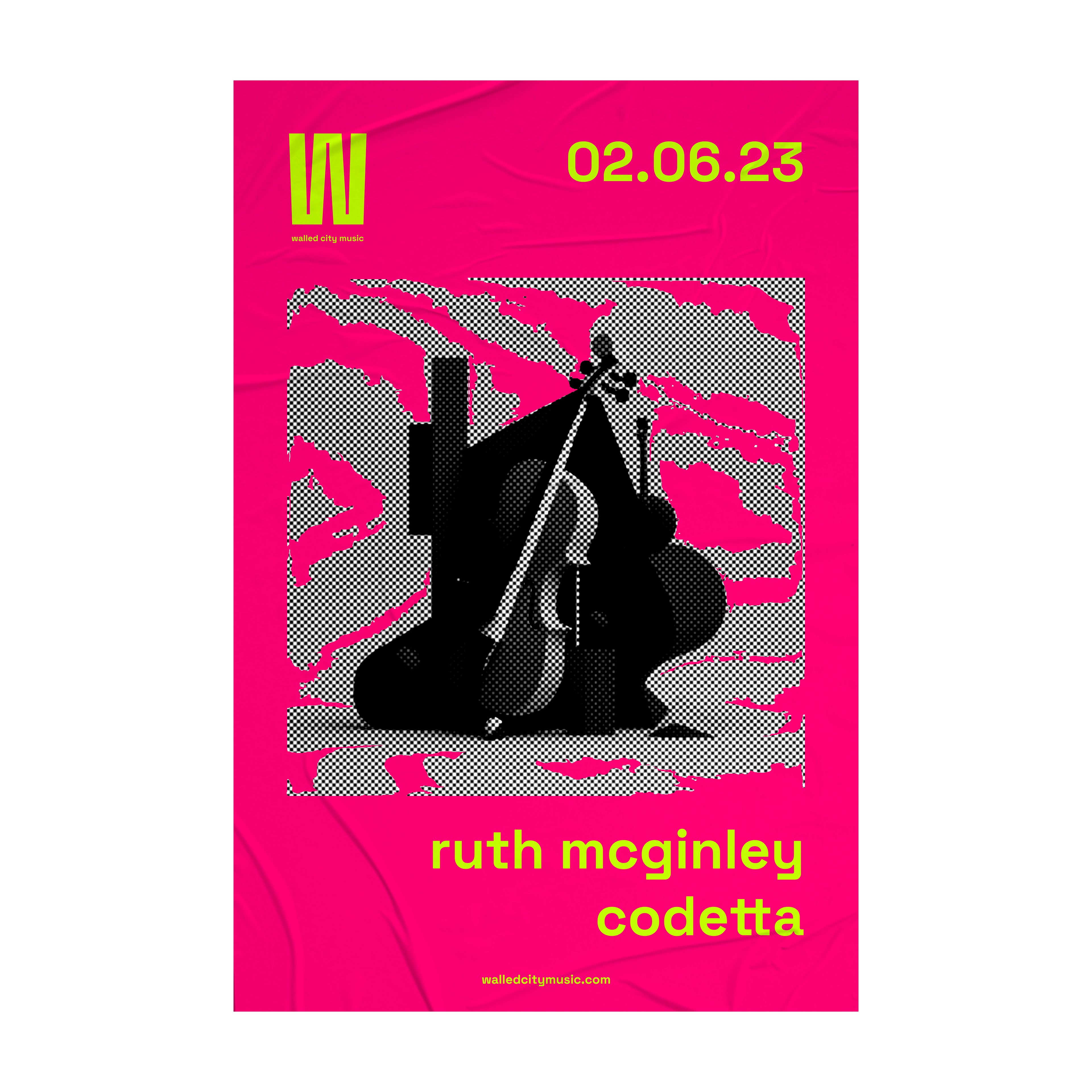
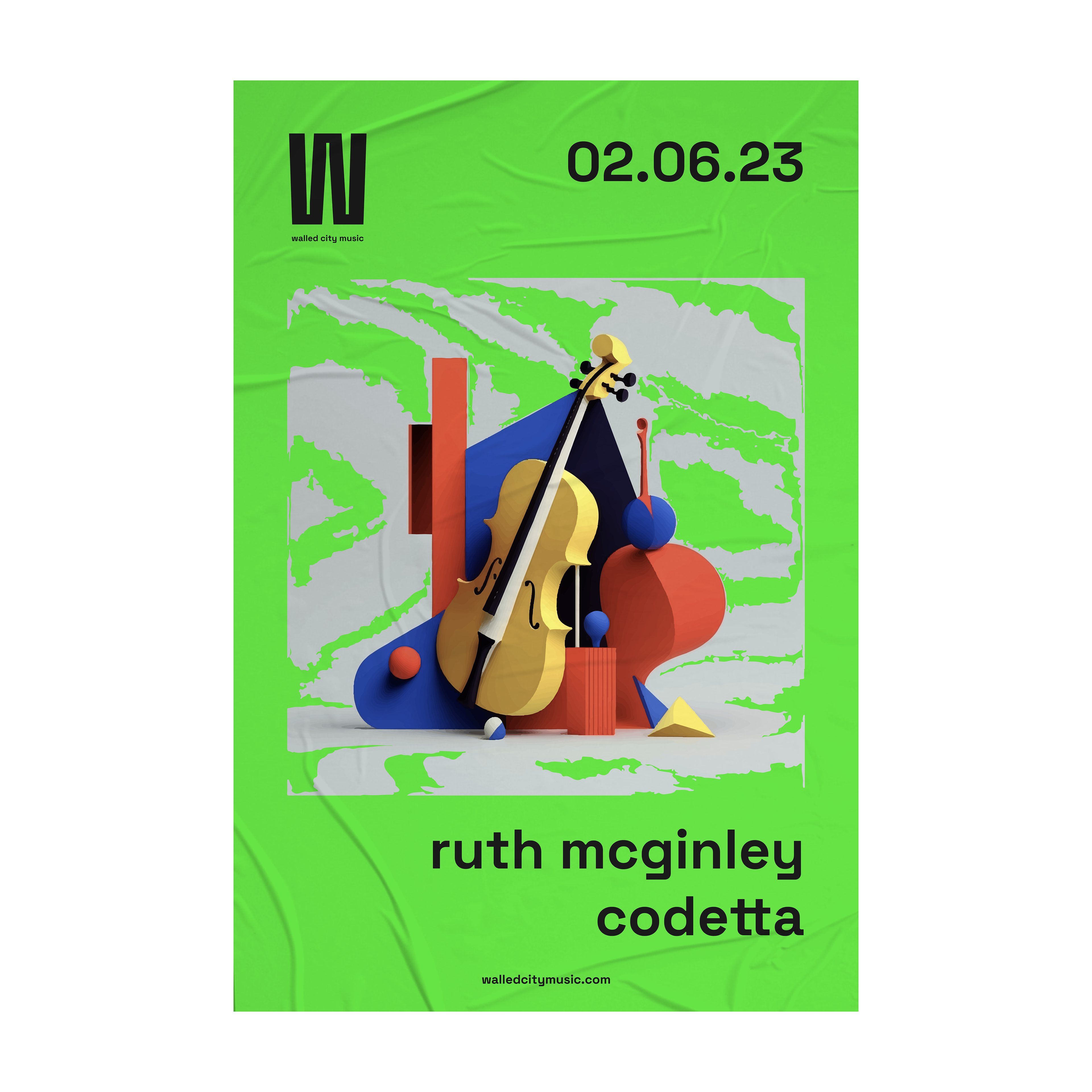
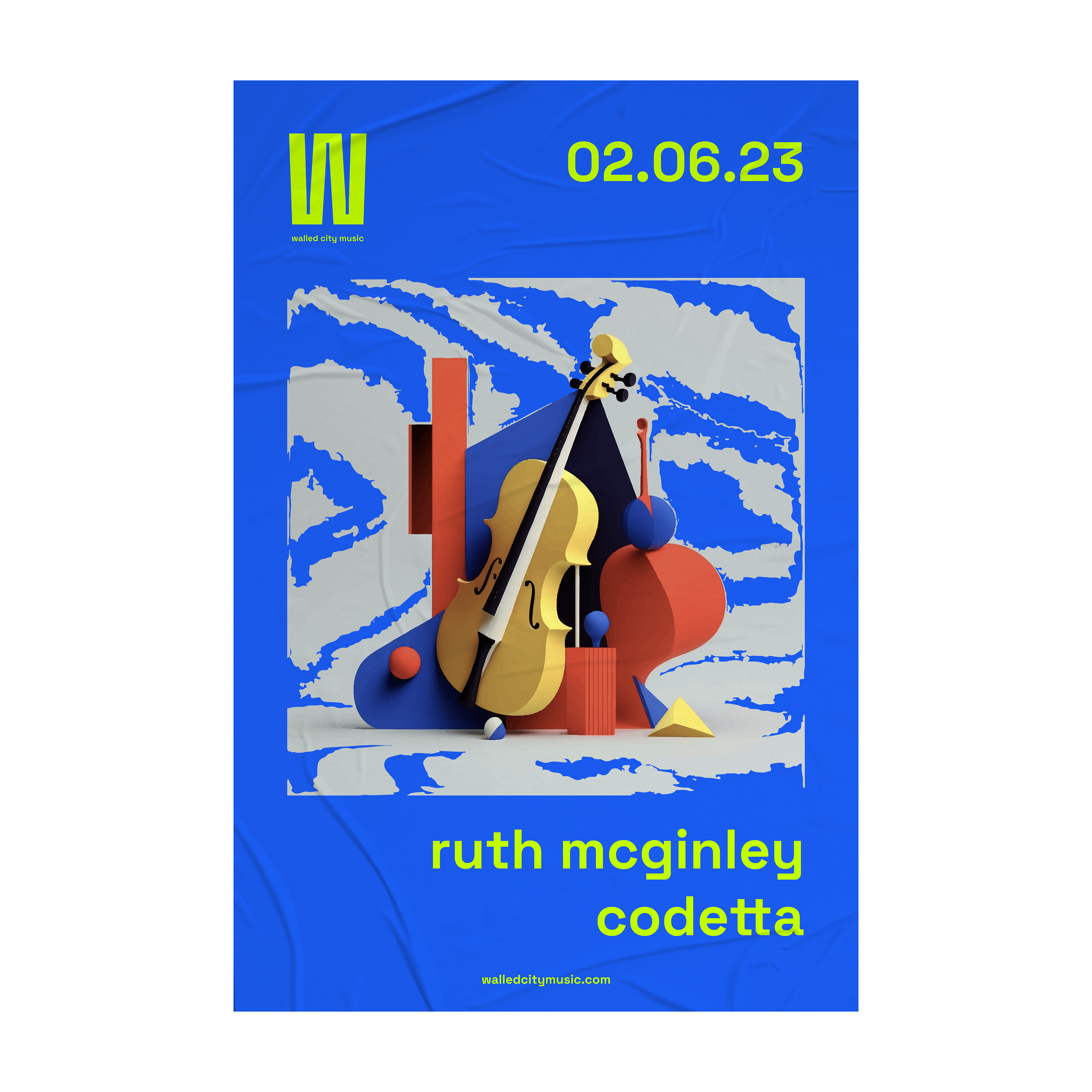

Rebrand for a leading promoter of contemporary classical, choral and jazz music based in Northern Ireland. The organisation wanted to distance itself from traditionally fusty classical music branding, with a strong emphasis on the excitement, energy and passion found in music. The elegant ‘W’ shape in this logo merges movement and musicality, serving as a visual metaphor for the flow of sound and music. The sweeping curves of the ‘W’ evoke the fluidity of an audio waveform, symbolising the dynamic nature of sound. The flowing lines also resemble the movement of a conductor’s baton, guiding an orchestra in perfect synchronisation. This reinforces the ideas of leadership and direction, which is important in the context of classical and choral music. The change in thickness within the 'W' shape — from narrow to broad as you move from left to right — suggests progression and forward motion. This is not only a visual cue but also a fitting representation for an organisation that prides itself on offering innovative and forward-thinking musical experiences. It emphasises growth and the breaking of boundaries in the pursuit of musical excellence. The chosen typeface used offers a contemporary and friendly aesthetic.


